Skip to content

ux

Beyond contentDescription: Accessibility in Compose Multiplatform

Accessibility in a nutshell

Let's start with a quick recap about definitions and general principles. a11y is the practice of designing an environment so that in can be used equally by everyone, regardless of their abilities.

Applied to digital platforms, this boils down to the POUR principles, i.e. the foundational principles identified by the WCAG:

  • Perceivable: information and UI components must be presented to users in a way they can perceive (e.g. images must have alternative text, clickable controls are apparent and their purpose is clear, etc.);
  • Operable: components must be usable and functionalities can be accessed via different inputs (e.g. via touch input or voice commands) without barriers;
  • Understandable: the operation of the UI must be readable, predictable and designed in a way to help users avoid mistakes or guide users to correct them;
  • Robust: content must be reliable to be interpreted by a variety of assistive technologies and resilient to still be usable as they evolve over time.

What Compose offers out-of-the-box

In an application like Raccoon, the simplest and most idiomatic way to create a UI is leveraging the org.jetbrains.compose.material3:material3 library which provides Compose Material 3 components for CMP, i.e. the Material 3 design system by Google.

This has a lot of advantages, it provides a unified "language" to define User Interfaces which follow well-established visual and behavioral patterns by design and from the ground-up. The library is extremely flexible: it provides "ready-made" versions for common UI elements (with several "extension slots" to adapt them to match the target look and feel). Moreover, since it is built upon theorg.jetbrains.compose.foundation:foundation library, when needed you have access to Compose foundational layer to create the custom elements you need. The MD system also comes with a standard library of symbols that have the role of a "visual dictionary" for icons to be used in front-ends.

With respect to a11y, Material 3 components and foundational components themselves have bult-in support for accessibility: they are designed to be recognizable, usable, multi-input and interoperable with assistive technologies (e.g. TalkBack on Android). Most of the time, they work "out of the box" with minimal interventions needed.

Just to make an example, buttons already come with semantics that make them recognizable as interactive components and their default layout has built-in elements (e.g. padding) which make them follow the guidelines for human interaction. If a button's only content were an icon, nonetheless, developers are encouraged to provide a description of the function of the button when the role of the symbol is not clear in its context.

Tip

In general, whenever a graphic element (image or video) is inserted with no textual equivalent, developers need to insert a content description to meet the aforementioned Perceivable requirement.

More specific interventions highly depend on the particular domain the application belongs to.

What we Actually Did

UX for Screen Readers

Raccoon, for example, is client for a social network. This implies that the type of content which is presented most frequently is the "feed": e.g. some kind of timeline with a sequence of posts, the sequence of answers to a given post, the list of posts created by a given user, etc.

In the UI representing a timeline, each post in a timeline has multiple interactive elements (avatar, author name, reply, reblog, favorite, bookmark, options). A screen reader user would have to swipe a dozen times just to get past a single post, which makes scrolling through a timeline cumbersome.

In order to overcome this issue, the main interventions have been:

  • Hiding Granularity: use Modifier.clearAndSetSemantics { } on individual buttons in the footer and header, so that they are removed from the primary focus loop.
  • Merging Descendants: apply Modifier.semantics(mergeDescendants = true) to the entire TimelineItem and TimelineReplyItem, so that the whole post is focused as one single unit.
  • Custom Actions: re-implement the hidden buttons as CustomAccessibilityActions attached to the main post container.

As a result, users can navigate from post to post with a single swipe. If they want to interact, they use the "Actions" gesture of their screen reader to select "Reply", "Favorite", etc.

Danger

A couple of caveats to avoid common pitfalls:

  • mergeDescendants can sometimes hide too much if not used carefully:
  • labels for CustomAccessibilityActions must be localized to remain truly accessible.

Key commits: 1aa17ea and 0b7adf1

Content Parity

In a federated environment like Mastodon or Friendica, content often arrives as raw HTML. Embedded images (inline elements) within post text often had important alt descriptions.

It is important that the value of this attribute is parsed (using Ksoup as a parser), passed up and used either ascontentDescription for Image composables or as alternateText for inline contents insideBasicText composables.

In this way, screen readers can now read the descriptions of images, both when they appear as media attachments and when they are embedded directly in the flow of a post.

On the other hand, nonetheless, too many contentDescription can also create too much noise: it is important to distinguish decorative VS functional items and annotate just the latter. So, as a part of the validation process, a systematic cleanup of alternate text properties was done.

Key commits: d2fc4dd

Semantic Integrity

A Switch or Checkbox next to a Text composable often results in two separate focus points, which is confusing and inefficient.

The solution to this is using Modifier.toggleable with Role.Checkbox or Role.Switch on the parent Row container, nullifying the onCheckedChange callback to avoid double-handling.

By doing so, the entire row is treated as a single interactive control: when focused, the screen reader announces the label and the state together.

Moreover, large lists like timelines or settings screens are hard to navigate if you can't jump to specific sections.

The solution is to apply Modifier.semantics { heading() } to: - post titles in the Timeline; - headers in the Settings screens.

In this way, screen reader users can change their navigation mode to "Headings" and jump directly from post to post or section to section, skipping the body text entirely if desired.

Key commits: 8ab2772

Community is Key

The overall purpose of dealing with a11y is inclusion, which means that nobody is alone.

Tasks can be overwhelming to tackle all by oneself, but in an inclusive community you can always rely on the support by others.

You may have noticed that the commits liked at the end of the previous paragraphs were not done by a single person.

This is because for Raccoon all the interventions and fine-tuning summarized so far were implemented, tested, and validated by at least two people: pvagner on the one side and the project maintainer on the other.

Why All This Matters

Ultimately, accessibility isn't a checklist or a set of technical hurdles: it is a commitment to our users' dignity. By moving beyond simple content descriptions and thinking about the semantic flow of our apps, we ensure that the Fediverse remains a place where the 'open' adjective in FOSS applies to everyone.

And, for fellow developers, the next time you build a component, ask yourself: is this just visible, or is it truly reachable?

Create Adaptive Designs with Window Size Classes

What are Window Size Classes?

Material Design 3 has introduced the concept of Window Size Classes to help developers abstract away the overwhelming variety of device viewports. Instead of designing for multiple specific screen resolutions, we can categorize available space into three opinionated buckets: Compact, Medium, and Expanded.

According to the official documentation, window size classes provide a bridge between designer-friendly breakpoints and developer-centric implementation. They allow us to focus on how the UI should transition between different states rather than worrying about specific pixel counts.

This is especially critical in a project like Raccoon, which targets multiple platforms (Android, iOS, and desktop) where available screen real estate can change in a heartbeat.

Multiplatform Implementation

In a KMP project, querying the current window size class requires platform-specific implementations. We can leverage the expect/actual mechanism to provide a clean, unified API to our common code:

  • Platform-specific query logic: Android requires an Activity context, while iOS and JVM can query window bounds directly.
  • Shared utilities: We keep our business logic DRY by placing the observation and reaction logic in commonMain.

Code Snippets

To obtain the current window size class and react to its changes dynamically:

// in commonMain
@Composable
expect fun getWindowSizeClass(): WindowSizeClass?

// in the androidMain source set
@Composable
actual fun getWindowSizeClass(): WindowSizeClass? {
    val activity = LocalActivity.current
    checkNotNull(activity) { return null }
    return calculateWindowSizeClass(activity)
}

// in iosMain
@Composable
actual fun getWindowSizeClass(): WindowSizeClass? {
    return calculateWindowSizeClass()
}

// in jvmMain
@Composable
actual fun getWindowSizeClass(): WindowSizeClass? {
    return calculateWindowSizeClass()
}

Once we have the size class, we can create shared utilities to make our UI code more readable:

// all in the commonMain source set
@Composable
fun isWidthSizeClassEqualOrAbove(other: WindowWidthSizeClass): Boolean {
    val current = getWindowSizeClass()?.widthSizeClass ?: WindowWidthSizeClass.Compact
    return current >= other
}

@Composable
fun isWidthSizeClassBelow(other: WindowWidthSizeClass): Boolean {
    val current = getWindowSizeClass()?.widthSizeClass ?: WindowWidthSizeClass.Compact
    return current < other
}

A Strategy for Adaptive Layouts

Following established best practices, I chose the Expanded width as our primary breakpoint for structural layout changes. Here’s how the experience shifts across devices:

Compact & Medium Screens

On smaller form factors, I prioritize reachability and density:

  • Bottom Navigation: Main sections are nested here for quick thumb access.
  • Modal Navigation Drawer: Reserved for secondary features and settings.
  • Floating Action Buttons: Tucked into the traditional bottom-right corner.

Expanded Screens

When we have the luxury of space on tablets and desktops, we can reduce navigation depth significantly:

  • Permanent Navigation Drawer: Replaces the bottom bar with a collapsible side panel.
  • Top Bar Actions: Common shortcuts migrate to the top bar for better visibility.
  • Multi-Pane Scaffolds: We move beyond single columns to leverage the full width.

Interestingly, since Raccoon features more than seven primary destinations, a standard Navigation Rail (the MD3 go-to for side navigation) wasn't feasible. This pushed us toward a more custom, collapsible drawer approach that maintains usability without clutter.

Leveraging Canonical Layouts

A cornerstone of Material Design 3 is the use of Canonical Layouts. These are battle-tested patterns—like List-Detail, Supporting Pane, and Feed—that provide a rock-solid foundation for adaptive applications.

In practice, this means reaching for specialized components like ListDetailPaneScaffold or SupportingPaneScaffold. When paired with sub-navigators like ThreePaneScaffoldNavigator, they unlock sophisticated navigation flows where "master" and "detail" views can seamlessly coexist or stack depending on available width—complete with beautiful, built-in animated transitions!

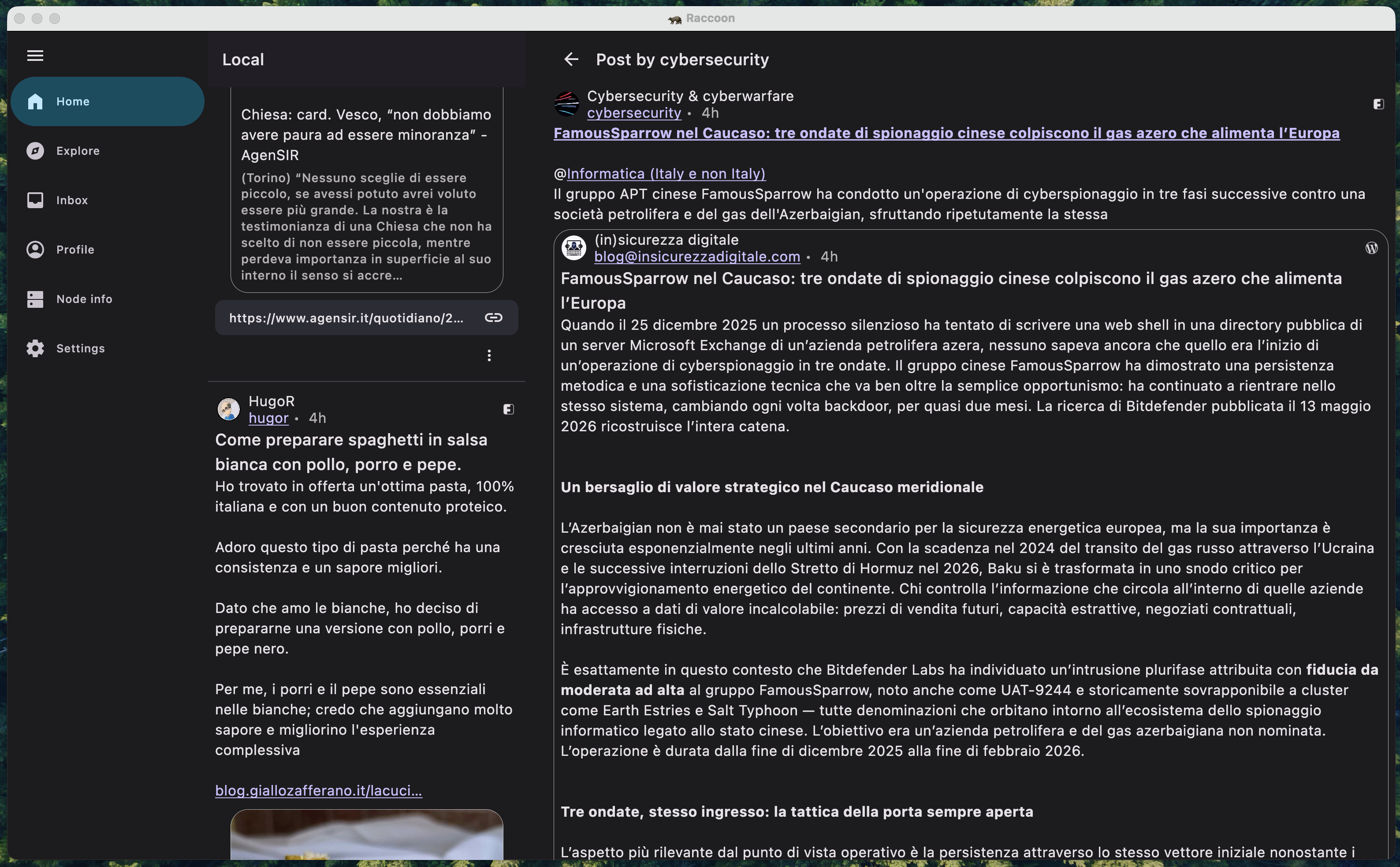
Adopting this approach often implies maintaining two distinct navigation graphs: one optimized for compact/medium screens and another for expanded layouts. A real-world example of this in Raccoon is the TimelineWithEntryDetailScreen, which dynamically reconfigures its internal structure on the fly.

screenshot of list-detail pane scaffold
A screenshot of timeline / detail two-pane scaffold.

Multiplatform and Beyond

This effort went hand-in-hand with adding support for the JVM target for the desktop app. By adopting window size classes, adding a completely new platform was remarkably smooth. The UI simply "snapped" into place once the desktop window bounds were mapped to the correct size classes.

Looking Ahead: Navigation 3

While the current approach of maintaining separate navigation graphs works well, the future of adaptive navigation in Compose looks even more promising. The upcoming Navigation 3 library introduces the concept of Scenes and Scene Strategies.

These allow developers to define how a destination should be displayed (e.g., as a full-screen pane, a detail pane, or even a bottom sheet) based on the current window size class, all without having to duplicate destination logic. It effectively abstracts the "where" and "how" of navigation away from the "what".

As of now, Navigation 3 is still in its early stages and might not be mature enough for production-heavy apps like ours. So I've decided to wait until the library stabilizes further, but the migration path is definitely on my radar.

Question

Who knows? Maybe future update could see Raccoon powered by these new scene-based strategies!

Swipe Navigation: turn your Fediverse feed into a page-turner

Question

Tired of the endless tap-back-tap dance? There's a better way to browse!

Picture this: You're deep-diving into your Mastodon timeline when you spot an intriguing post. You tap to read the full discussion, scan through replies, then… tap back. Find your place again. Tap the next post. Repeat. Does it sound familiar?

What if scrolling through social content felt as natural as flipping through a magazine? Enter swipe navigation – the game-changing UX pattern that's transforming how we consume Fediverse content.

Problem: lost in navigation hell

Every Fediverse platform has its building blocks – Lemmy's posts, Mastodon/GNU social's statuses, Friendica's items – but they all share the same fundamental challenge. These content units live in lists: timelines, author feeds, community threads, search results. And traditionally, exploring them means constant context switching.

The typical mobile experience goes like this:

  1. Scroll through feed
  2. Tap interesting content
  3. Read, engage, absorb
  4. Hit back (losing your flow)
  5. Hunt for where you left off
  6. Repeat until frustrated

This master-detail navigation works on large screens, but on mobile? It's a focus-killer and engagement-destroyer.

Solution: think of a book, not a db

Swipe navigation flips the script – literally. Instead of treating content as isolated database entries, it transforms your feed into a flowing narrative where each post is simply the next page in your story.

Swipe right: Previous content
Swipe left: Next content
Stay engaged: Never lose your place

It's that simple. No more navigation gymnastics, no more losing your scroll position, no more breaking your reading flow.

The technical behind the scenes

Making this feel effortless requires some clever engineering. Here's how we solved it in the Raccoon apps:

Smart pagination memory

We maintain a "snapshot" of your current browsing context:

  • current pagination specification i.e. all the data which are needed, if you have page n, to get page n+1;
  • partial list of all the contents which have been downloaded so far;
  • current pagination status (e.g. the current page index or the next "pagination token", the information about whether there are more pages or not).

Intelligent prefetching

As you swipe toward the end of loaded content, the app quietly fetches the next batch in the background. You get the illusion of infinite content without wait times, data waste or battery draining, because only as many contents are downloaded as they are likely to be seen.

Context navigation stack

Here's where things get interesting. What happens when you're browsing your home timeline, then dive into someone's profile, then start swiping through their posts?

We solved this with a navigation stack – think of it as breadcrumbs for your browsing session. Each time you enter a new feed context, we push a new state onto the stack. When you navigate back, we pop it off and restore exactly where you were in the previous feed.

Example flow:

  1. Browsing home timeline (State A)
  2. Open user profile → New context (State B pushed)
  3. Swipe through their posts using State B pagination
  4. Hit back → Pop State B, restore State A
  5. Continue exactly where you left off in home timeline

Why this matters for the Fediverse

This isn't just about smoother UX – it's about engagement and adoption. The Fediverse is competing with highly polished corporate platforms that have spent billions optimizing user experience.

Swipe navigation levels the playing field by:

  • Reducing friction: fewer taps, less cognitive load
  • Maintaining flow state: users stay immersed in content
  • Feeling native: matches expected mobile interaction patterns
  • Encouraging exploration: easier to discover new content and creators

The Relay legacy

Fun fact: This navigation pattern gained popularity in the Reddit ecosystem through the Relay app, which is why some developers still call it "Relay-style navigation." It proved so effective that it became a sought-after feature across Threadiverse clients, and now it's making its way into broader Fediverse apps.

Building a better social web

Every interaction pattern we choose shapes how people experience the open social web. Swipe navigation might seem like a small UX detail, but it represents something bigger: the commitment to making decentralized platforms not just functional, but delightful.

When users can lose themselves in their feeds – really get into that flow state where time disappears and content discovery feels effortless – that's when the Fediverse truly competes with the walled gardens.

The future of social media is open, decentralized, and user-controlled. But it also needs to feel amazing to use. Swipe navigation is one piece of that puzzle, turning mechanical browsing into intuitive exploration.

Ready to transform your Fediverse experience? Look for apps that support swipe navigation, or if you're a developer, consider implementing this pattern in your next project. Your users' engagement levels will thank you.

Question

What navigation patterns do you think could improve the Fediverse experience? Share your thoughts and help us build better social tools for everyone.