Skip to content

compose

On mobile, and increasingly on desktop, every app needs a solid navigation system. It isn't just a UI pattern (like master-detail) or managing back gestures; it's the very skeleton of the user experience and a fundamental block in the user's mental model. When taking certain actions, users expect to transition from one fullscreen page to another; when taking others, they expect a modal (dialog or bottom sheet) to appear, and so on.

Why Navigation is Complex

Unfortunately, Navigation is rarely straightforward. In declarative UI paradigms like Compose, components render a state that needs to be retained across recompositions. Depending on the platform, this state must also survive configuration changes and process death.

As I discussed in a previous article, state holders have lifecycles bound to a view's visibility. When a view enters the viewport, the holder is born; when it's gone, it's destroyed to free up memory.

Sometimes, parameters need to be passed back and forth between navigation entries: input data for an item accessed from a list, or output data from a user selection. Other times, "shared data" must be retained across several entries, such as in wizards or user journeys spanning multiple screens.

All of this has deep implications for DI, memory management, and app architecture.

Choosing a Path

When I started with CMP in 2023, JetBrains hadn't yet released an official navigation solution. The community filled this void with several alternatives:

In my early experiments, I tested Precompose and Decompose on desktop but ultimately chose Voyager for mobile. Its practicality was its biggest selling point: the "Holy Trinity" of Screen, ScreenModel, and Navigator made everything feel easy and compact.

The Voyager Reality Check

To be honest: something felt off right from the start: the model was quite intrusive. In Compose, all UI elements (including fullscreen pages) are functions, but in Voyager, screens were objects. Over time, as complexity piled up, cracks began to show.

The Serialization Trap

I discovered the hard way that Screens aren't regular objects that can hold any instance variables. On Android, for example, all their members must be either primitives or types that can be stored in a Bundle.

To handle multiplatform state restoration, you have to define an expect interface,1 actualized by a tagging interface on non-JVM platforms and by a typealias of java.io.Serializable (details here).

This was quite fragile and I remember it breaking during Gradle/AGP upgrades.

I eventually opted to fall back on primitives (like IDs) for passing data between screens and added a custom cache layer just to store items before a transition.

Even before tackling adaptive layouts, I had to deal with nested navigation (main stack + bottom bar + drawer). I ended up encapsulating the logic into adapters and helpers (like NavigationCoordinator and NavigationAdapter, plus a MainRouter to manage modularization by feature).

Then there were deep links. Voyager's own documentation admits that it doesn't provide a built-in solution for handling deep link URIs.

Switch to Navigation Compose

In 2024, JetBrains ported Navigation Compose to Multiplatform, starting with version 1.6.10. By the end of that year, version 1.7.0 also introduced type-safe navigation.

Therefore, in mid-2025, I took the opportunity to migrate the whole project. It wasn't easy, it took roughly one week per project,2 but moving to a standard solution felt like finally having solid ground under my feet.

Ironically, the adapters I created to encapsulate Voyager's workarounds proved useful. They decoupled the client project from the navigation library itself, so the migration mostly involved changing those internal classes: instead of wrapping a Navigator instance, they wrapped around a NavController.

But the story didn't end there. By late 2025, I planned to add desktop support and improve layouts for tablets and foldables. This meant dealing with Adaptive Layouts: representing master-detail as two separate screens on small devices but as a two-pane single screen on larger ones (using ListDetailPaneScaffold).

In Navigation Compose, I ended up with two different navigation graphs: dedicated two-pane destinations for large screens and separate destinations for mobile.

Enter Navigation 3

Meanwhile, Google released Navigation 3. Its biggest advantage was giving the client app full ownership of the backstack. It also introduced SceneStrategy, which decoupled navigation entries from their layout strategy. This meant master and detail destination definitions could remain independent of how they were presented.

Navigation 3 entered CMP in version 1.10.0 at the start of 2026. Roughly a year after moving to Navigation Compose, I decided to re-migrate everything to Navigation 3.

For those interested, here is my migration checklist:

  • ensure all destinations comply with the NavKey interface and setting up SavedStateConfiguration for multiplatform state restoration;
  • replace old constructs (NavHost, NavController, NavGraph) with the new ones (NavDisplay, NavBackStack, NavEntryDecorator, SceneStrategy);
  • remove ListDetailPaneScaffold usages and cleaning up the dual graph definitions;
  • tests, tests and more tests (both automated and manual ones).

This time, my adapters turned against me. The recommended approach for Navigation 3 is to use a NavigationState holder and a Navigator class (see the migration guide), whereas I was relying on NavigationCoordinator and NavigationAdapter.

Eventually I chose to keep my existing surface API but updated the internal implementation, which was also a great excuse to polish some "encrustations of time" like an old throttling mechanism which was not needed any more.

Lessons Learned

If I could go back to 2023, here is what I'd tell myself:

  1. Standardization > Easiness: A compact library might save time today but cost months tomorrow.
  2. Mind compromises: Don't pick a library that treats deep links as an afterthought, choices can backfire.
  3. Build Adaptive from Day One: Even if you're only on mobile now, you'll want those extra pixels later.
  4. Be prepared to change: As already stated in other articles in this blog, changes are inevitable, so embrace them as improvement opportunities.
  1. Expect/actual classes and interfaces are in Beta. You can opt in with the compiler flag -Xexpect-actual-classes. ↩

  2. Specifically, migrating both the Mastodon/Friendica client and the Lemmy client. ↩

One Preview to Rule Them All: Unified Compose Previews in Common Code

Until late 2025, managing UI previews in a Compose Multiplatform (CMP) project felt like navigating a minefield of compromises. The ecosystem was fragmented, and achieving a seamless "write once, see everywhere" experience was surprisingly difficult.

The Fragmented Past of CMP Previews

Back in the dark ages, there were three distinct ways to handle previews:

  1. androidx.compose.ui.tooling.preview.Preview: the standard for androidMain, well-supported by Android Studio and IntelliJ IDEA, requiring compose.preview in your dependencies;
  2. androidx.compose.desktop.ui.tooling.preview.Preview: specific to desktopMain, supported by IDEs via a plugin with minimal build setup;
  3. org.jetbrains.compose.ui.tooling.preview.Preview: the common option that worked across all source sets, but with limited IDE support (mostly restricted to Fleet), requiring compose.components.uiToolingPreview in commonMain.

For my workflow, none of these were perfect. I never found Fleet to be a viable daily driver due to its early-stage stability and uncertain pricing model, so option #3 was out. Since my focus was primarily on mobile, the desktop-only preview (#2) wasn't of much help either.

That left me with the Android-specific annotation (#1). However, since this annotation was only recognized within the androidMain source set and all my Composables lived in commonMain, I would have been forced to maintain previews in separate files. Worse yet, I couldn't see them unless I kept the Android counterpart open in a parallel pane.

So I decided to wait for the ecosystem to mature. After all, the friction only affected my Developer Experience, end-users were not affected in any way.

The Turning Point

The game changed with the release of Compose Multiplatform 1.10.0. This version introduced a unified androidx.compose.ui.tooling.preview.Preview annotation that can be used directly in commonMain and is fully recognized by both Android Studio and IntelliJ IDEA.

Of course, a unified experience requires some intentional configuration. To get this working some steps are needed:

  • add the org.jetbrains.compose.ui:ui-tooling-preview dependency to your commonMain source set;
  • if you apply the com.android.kotlin.multiplatform.library plugin, you must ensure org.jetbrains.compose.ui:ui-tooling is available in the androidRuntimeClasspath.

In my project, I manage configuration through a convention plugin. I had to adjust my KotlinMultiplatformAndroidLibraryExtension setup to inject the necessary runtime dependency:

class ComposeMultiplatformPlugin : Plugin<Project> {
    override fun apply(target: Project): Unit =
        with(target) {
            extensions.configure(KotlinMultiplatformExtension::class.java) {
                targets.withType(KotlinMultiplatformAndroidLibraryTarget::class.java)
                    .configureEach {
                        apply<KotlinMultiplatformAndroidLibraryExtension> {
                            dependencies.add(
                                "androidRuntimeClasspath",
                                libs.findLibrary("compose-ui-tooling").get(),
                            )
                        }
                    }
            }
        }
}

The Resource Roadblock

I thought I was in the clear. But as it turns out, I had only scratched the surface. As soon as I started adding the first preview, I realized that my previous architectural decisions regarding resource management were blocking the way.

My UI relied heavily on CompositionLocals for drawables and localized strings. Furthermore, resource access was abstracted away through interfaces (CoreResources and Strings), with concrete implementations (DefaultCoreResources and DefaultStrings) locked inside the :shared subproject.1

This architecture was a relic of an era before native Compose resources, back when I used Lyricist and moko-resources. This setup had remained incredibly flexible though, and I wasn't ready to abandon it just for the sake of previews.

To preserve both subproject-specific previews and clean encapsulation, I performed a targeted refactor. I moved the concrete resource adapters from :shared to their respective modules (:core:resources and :core:l10n). I also exposed the DI bindings via public modules (resourceModule and l10nModule), which were previously internal in :shared.

Eventually, I created an extension function in :core:commonui:components to factor out the DI setup for previews:

@Composable
fun RootDI.SetupPreview(vararg modules: DI.Module) = remember {
        di = DI {
            importAll(resourcesModule, l10nModule, *modules)
        }
    }

This refactoring didn't just give me functional previews in common code; it also allowed me to eliminate redundant test doubles for resources. Because my unit tests now have access to the actual resource adapters within their subprojects, the tests are both simpler and more realistic.

Closing Thoughts

Unified previews have bridged the gap between common code and visual feedback, making the "multiplatform" part of Compose truly first-class. In the future, I'll be adding more of them (as of now, I concentrated on :core:commonui:components as I was experimenting): it makes it easier to maintain the project and spot bugs earlier.

In my case, I believe waiting until a mature solution emerged was a winning strategy. Balancing trade-offs between functionality and complexity is worth if it improves UX, but here it only involved DX (and this is mostly a one-man project); so it could be put off with no impact.

Finally, as always, adopting new parts of a technology was an opportunity for me to improve code architecture, remove obsolete workarounds and cleanup boilerplate. And this is one of the main reasons I work on this project: learn new things, refactor, improve code quality and ultimately myself as a developer.


  1. In this context "subproject" and "module" can not be used interchangeably. From now on, " subproject" will refer to a build configuration unit, "module" will refer to a DI configuration unit. ↩

Beyond contentDescription: Accessibility in Compose Multiplatform

Accessibility in a nutshell

Let's start with a quick recap about definitions and general principles. a11y is the practice of designing an environment so that in can be used equally by everyone, regardless of their abilities.

Applied to digital platforms, this boils down to the POUR principles, i.e. the foundational principles identified by the WCAG:

  • Perceivable: information and UI components must be presented to users in a way they can perceive (e.g. images must have alternative text, clickable controls are apparent and their purpose is clear, etc.);
  • Operable: components must be usable and functionalities can be accessed via different inputs (e.g. via touch input or voice commands) without barriers;
  • Understandable: the operation of the UI must be readable, predictable and designed in a way to help users avoid mistakes or guide users to correct them;
  • Robust: content must be reliable to be interpreted by a variety of assistive technologies and resilient to still be usable as they evolve over time.

What Compose offers out-of-the-box

In an application like Raccoon, the simplest and most idiomatic way to create a UI is leveraging the org.jetbrains.compose.material3:material3 library which provides Compose Material 3 components for CMP, i.e. the Material 3 design system by Google.

This has a lot of advantages, it provides a unified "language" to define User Interfaces which follow well-established visual and behavioral patterns by design and from the ground-up. The library is extremely flexible: it provides "ready-made" versions for common UI elements (with several "extension slots" to adapt them to match the target look and feel). Moreover, since it is built upon theorg.jetbrains.compose.foundation:foundation library, when needed you have access to Compose foundational layer to create the custom elements you need. The MD system also comes with a standard library of symbols that have the role of a "visual dictionary" for icons to be used in front-ends.

With respect to a11y, Material 3 components and foundational components themselves have bult-in support for accessibility: they are designed to be recognizable, usable, multi-input and interoperable with assistive technologies (e.g. TalkBack on Android). Most of the time, they work "out of the box" with minimal interventions needed.

Just to make an example, buttons already come with semantics that make them recognizable as interactive components and their default layout has built-in elements (e.g. padding) which make them follow the guidelines for human interaction. If a button's only content were an icon, nonetheless, developers are encouraged to provide a description of the function of the button when the role of the symbol is not clear in its context.

Tip

In general, whenever a graphic element (image or video) is inserted with no textual equivalent, developers need to insert a content description to meet the aforementioned Perceivable requirement.

More specific interventions highly depend on the particular domain the application belongs to.

What we Actually Did

UX for Screen Readers

Raccoon, for example, is client for a social network. This implies that the type of content which is presented most frequently is the "feed": e.g. some kind of timeline with a sequence of posts, the sequence of answers to a given post, the list of posts created by a given user, etc.

In the UI representing a timeline, each post in a timeline has multiple interactive elements (avatar, author name, reply, reblog, favorite, bookmark, options). A screen reader user would have to swipe a dozen times just to get past a single post, which makes scrolling through a timeline cumbersome.

In order to overcome this issue, the main interventions have been:

  • Hiding Granularity: use Modifier.clearAndSetSemantics { } on individual buttons in the footer and header, so that they are removed from the primary focus loop.
  • Merging Descendants: apply Modifier.semantics(mergeDescendants = true) to the entire TimelineItem and TimelineReplyItem, so that the whole post is focused as one single unit.
  • Custom Actions: re-implement the hidden buttons as CustomAccessibilityActions attached to the main post container.

As a result, users can navigate from post to post with a single swipe. If they want to interact, they use the "Actions" gesture of their screen reader to select "Reply", "Favorite", etc.

Danger

A couple of caveats to avoid common pitfalls:

  • mergeDescendants can sometimes hide too much if not used carefully:
  • labels for CustomAccessibilityActions must be localized to remain truly accessible.

Key commits: 1aa17ea and 0b7adf1

Content Parity

In a federated environment like Mastodon or Friendica, content often arrives as raw HTML. Embedded images (inline elements) within post text often had important alt descriptions.

It is important that the value of this attribute is parsed (using Ksoup as a parser), passed up and used either ascontentDescription for Image composables or as alternateText for inline contents insideBasicText composables.

In this way, screen readers can now read the descriptions of images, both when they appear as media attachments and when they are embedded directly in the flow of a post.

On the other hand, nonetheless, too many contentDescription can also create too much noise: it is important to distinguish decorative VS functional items and annotate just the latter. So, as a part of the validation process, a systematic cleanup of alternate text properties was done.

Key commits: d2fc4dd

Semantic Integrity

A Switch or Checkbox next to a Text composable often results in two separate focus points, which is confusing and inefficient.

The solution to this is using Modifier.toggleable with Role.Checkbox or Role.Switch on the parent Row container, nullifying the onCheckedChange callback to avoid double-handling.

By doing so, the entire row is treated as a single interactive control: when focused, the screen reader announces the label and the state together.

Moreover, large lists like timelines or settings screens are hard to navigate if you can't jump to specific sections.

The solution is to apply Modifier.semantics { heading() } to: - post titles in the Timeline; - headers in the Settings screens.

In this way, screen reader users can change their navigation mode to "Headings" and jump directly from post to post or section to section, skipping the body text entirely if desired.

Key commits: 8ab2772

Community is Key

The overall purpose of dealing with a11y is inclusion, which means that nobody is alone.

Tasks can be overwhelming to tackle all by oneself, but in an inclusive community you can always rely on the support by others.

You may have noticed that the commits liked at the end of the previous paragraphs were not done by a single person.

This is because for Raccoon all the interventions and fine-tuning summarized so far were implemented, tested, and validated by at least two people: pvagner on the one side and the project maintainer on the other.

Why All This Matters

Ultimately, accessibility isn't a checklist or a set of technical hurdles: it is a commitment to our users' dignity. By moving beyond simple content descriptions and thinking about the semantic flow of our apps, we ensure that the Fediverse remains a place where the 'open' adjective in FOSS applies to everyone.

And, for fellow developers, the next time you build a component, ask yourself: is this just visible, or is it truly reachable?


Create Adaptive Designs with Window Size Classes

What are Window Size Classes?

Material Design 3 has introduced the concept of Window Size Classes to help developers abstract away the overwhelming variety of device viewports. Instead of designing for multiple specific screen resolutions, we can categorize available space into three opinionated buckets: Compact, Medium, and Expanded.

According to the official documentation, window size classes provide a bridge between designer-friendly breakpoints and developer-centric implementation. They allow us to focus on how the UI should transition between different states rather than worrying about specific pixel counts.

This is especially critical in a project like Raccoon, which targets multiple platforms (Android, iOS, and desktop) where available screen real estate can change in a heartbeat.

Multiplatform Implementation

In a KMP project, querying the current window size class requires platform-specific implementations. We can leverage the expect/actual mechanism to provide a clean, unified API to our common code:

  • Platform-specific query logic: Android requires an Activity context, while iOS and JVM can query window bounds directly.
  • Shared utilities: We keep our business logic DRY by placing the observation and reaction logic in commonMain.

Code Snippets

To obtain the current window size class and react to its changes dynamically:

// in commonMain
@Composable
expect fun getWindowSizeClass(): WindowSizeClass?

// in the androidMain source set
@Composable
actual fun getWindowSizeClass(): WindowSizeClass? {
    val activity = LocalActivity.current
    checkNotNull(activity) { return null }
    return calculateWindowSizeClass(activity)
}

// in iosMain
@Composable
actual fun getWindowSizeClass(): WindowSizeClass? {
    return calculateWindowSizeClass()
}

// in jvmMain
@Composable
actual fun getWindowSizeClass(): WindowSizeClass? {
    return calculateWindowSizeClass()
}

Once we have the size class, we can create shared utilities to make our UI code more readable:

// all in the commonMain source set
@Composable
fun isWidthSizeClassEqualOrAbove(other: WindowWidthSizeClass): Boolean {
    val current = getWindowSizeClass()?.widthSizeClass ?: WindowWidthSizeClass.Compact
    return current >= other
}

@Composable
fun isWidthSizeClassBelow(other: WindowWidthSizeClass): Boolean {
    val current = getWindowSizeClass()?.widthSizeClass ?: WindowWidthSizeClass.Compact
    return current < other
}

A Strategy for Adaptive Layouts

Following established best practices, I chose the Expanded width as our primary breakpoint for structural layout changes. Here’s how the experience shifts across devices:

Compact & Medium Screens

On smaller form factors, I prioritize reachability and density:

  • Bottom Navigation: Main sections are nested here for quick thumb access.
  • Modal Navigation Drawer: Reserved for secondary features and settings.
  • Floating Action Buttons: Tucked into the traditional bottom-right corner.

Expanded Screens

When we have the luxury of space on tablets and desktops, we can reduce navigation depth significantly:

  • Permanent Navigation Drawer: Replaces the bottom bar with a collapsible side panel.
  • Top Bar Actions: Common shortcuts migrate to the top bar for better visibility.
  • Multi-Pane Scaffolds: We move beyond single columns to leverage the full width.

Interestingly, since Raccoon features more than seven primary destinations, a standard Navigation Rail (the MD3 go-to for side navigation) wasn't feasible. This pushed us toward a more custom, collapsible drawer approach that maintains usability without clutter.

Leveraging Canonical Layouts

A cornerstone of Material Design 3 is the use of Canonical Layouts. These are battle-tested patterns—like List-Detail, Supporting Pane, and Feed—that provide a rock-solid foundation for adaptive applications.

In practice, this means reaching for specialized components like ListDetailPaneScaffold or SupportingPaneScaffold. When paired with sub-navigators like ThreePaneScaffoldNavigator, they unlock sophisticated navigation flows where "master" and "detail" views can seamlessly coexist or stack depending on available width—complete with beautiful, built-in animated transitions!

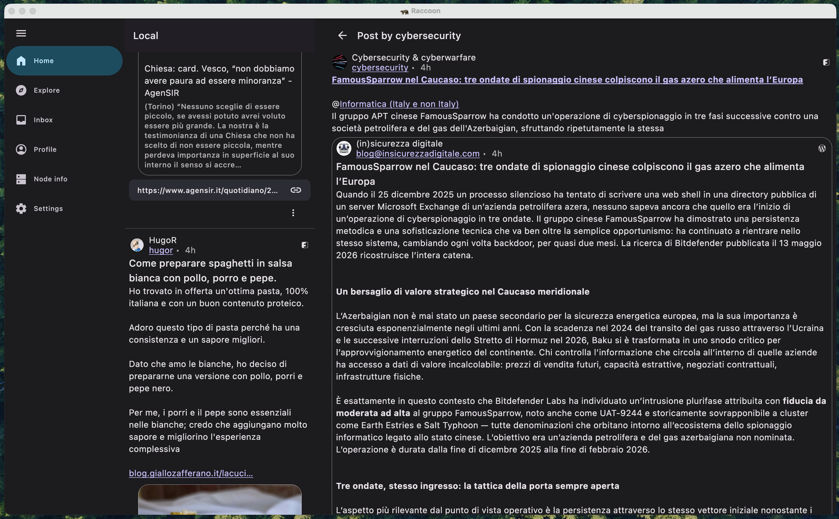
Adopting this approach often implies maintaining two distinct navigation graphs: one optimized for compact/medium screens and another for expanded layouts. A real-world example of this in Raccoon is the TimelineWithEntryDetailScreen, which dynamically reconfigures its internal structure on the fly.

screenshot of list-detail pane scaffold
A screenshot of timeline / detail two-pane scaffold.

Multiplatform and Beyond

This effort went hand-in-hand with adding support for the JVM target for the desktop app. By adopting window size classes, adding a completely new platform was remarkably smooth. The UI simply "snapped" into place once the desktop window bounds were mapped to the correct size classes.

Looking Ahead: Navigation 3

While the current approach of maintaining separate navigation graphs works well, the future of adaptive navigation in Compose looks even more promising. The upcoming Navigation 3 library introduces the concept of Scenes and Scene Strategies.

These allow developers to define how a destination should be displayed (e.g., as a full-screen pane, a detail pane, or even a bottom sheet) based on the current window size class, all without having to duplicate destination logic. It effectively abstracts the "where" and "how" of navigation away from the "what".

As of now, Navigation 3 is still in its early stages and might not be mature enough for production-heavy apps like ours. So I've decided to wait until the library stabilizes further, but the migration path is definitely on my radar.

Question

Who knows? Maybe future update could see Raccoon powered by these new scene-based strategies!