Skip to content

2026

Breaking Language Barriers: Client-Side Translation in the Fediverse

The Multilingual Reality of ActivityPub

The Fediverse is built on the promise of decentralized, equal communication. However, when users from different instances federate, they often encounter a barrier that code alone can not fix: language. While global connectivity is built into the protocol, making sense of foreign content often requires external tools that many servers do not provide.

Why Server-Side Translation is Rare

Services like Mastodon are designed to integrate with translation providers, so that users can toggle on-demand translation for posts appearing in their timelines.

This integration is not automatic, though, it has to be explicitly configured by instance administrators:

  • if requests are routed to an external provider (such as DeepL or a LibreTranslate instance), admins have to configure an API key and pay the costs for translations;
  • alternatively, since LibreTranslate is a self-hostable FOSS appliance, it can be installed on a server they already own (even the same hosting the instance), but they still need to pay for used resources.

As a result, not many instances (especially smaller ones) offer server-side translation, as they are run by volunteers who already run instances at their own expenses, often on a not-so-generous budget.

A growing user base already means more storage and computational resources are needed just for content management, so it is no surprise that translation is an expense worth sacrificing.

Empowering Clients

A possible solution to this is managing translation on the client-side. This doesn't necessarily mean running a local AI model on-device; while privacy-preserving, the large download size and high memory demands can be a dealbreaker for many mobile users.

A more flexible approach is allowing users to connect to their preferred translation service directly. By sending requests to a user-configured LibreTranslate instance and using their own API key, the cost and quota management are decentralized.

This removes the financial burden from instance admins while giving users control over their data. They can choose their trusted service and have their saying in whom data is sent to.

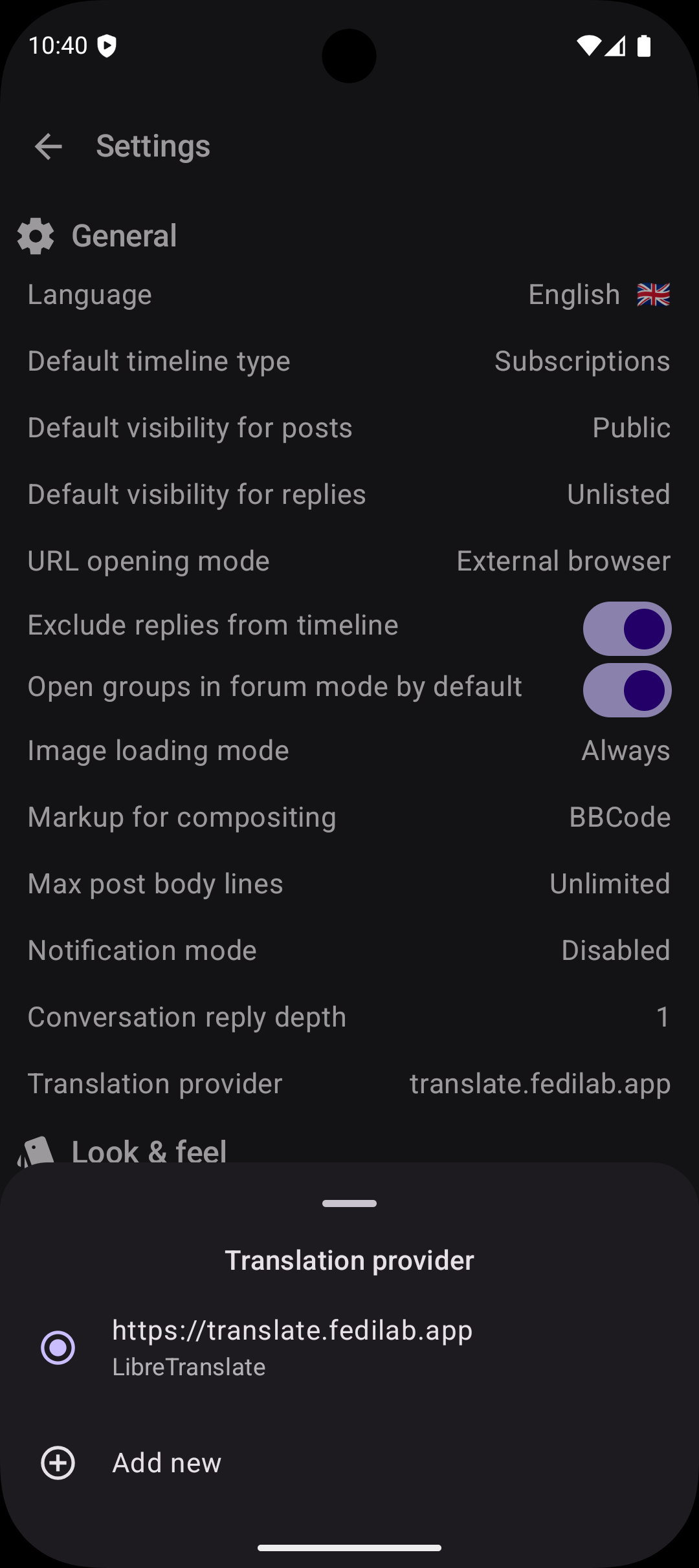
This is the path may apps have taken, including Raccoon. In the settings screen it is possible to configure one or more translation providers and choose the default one.

screenshot of the Settings page
Translation provider configuration bottom sheet.

For now the only supported provider is LibreTranslate: its configuration require the user to enter the instance URL and their API key (most instances require one).

Once a translation provider has been selected, the options menu in each post whose language is not the current one,1 contains an option to toggle translation. When selected, the original content is swapped with the translation and the drop-down menu option allows to switch back to the source version.

A Bit of History

Getting this right was not an overnight process. Before integrating with LibreTranslate I experimented with another third-party service (see #746) but the output was very low quality. Users complained, I listened to their feedback and decided to remove it.

The new architecture implemented in #1176 is built on two core principles: user choice and extensibility.

It is flexible enough to let users configure more than one service and extensible enough so developers can add other implementations for different providers (local or remote).

Question

How do you currently handle posts in languages you don't speak? Do you rely on your instance’s built-in tools, or do you find yourself copy-pasting into external browser? Let's talk about how we can make the Fediverse feel more like a global neighborhood.


  1. The current language corresponds to the app's on (from Settings), the post's one corresponds to its language property. ↩

Beyond contentDescription: Accessibility in Compose Multiplatform

Accessibility in a nutshell

Let's start with a quick recap about definitions and general principles. a11y is the practice of designing an environment so that in can be used equally by everyone, regardless of their abilities.

Applied to digital platforms, this boils down to the POUR principles, i.e. the foundational principles identified by the WCAG:

  • Perceivable: information and UI components must be presented to users in a way they can perceive (e.g. images must have alternative text, clickable controls are apparent and their purpose is clear, etc.);
  • Operable: components must be usable and functionalities can be accessed via different inputs (e.g. via touch input or voice commands) without barriers;
  • Understandable: the operation of the UI must be readable, predictable and designed in a way to help users avoid mistakes or guide users to correct them;
  • Robust: content must be reliable to be interpreted by a variety of assistive technologies and resilient to still be usable as they evolve over time.

What Compose offers out-of-the-box

In an application like Raccoon, the simplest and most idiomatic way to create a UI is leveraging the org.jetbrains.compose.material3:material3 library which provides Compose Material 3 components for CMP, i.e. the Material 3 design system by Google.

This has a lot of advantages, it provides a unified "language" to define User Interfaces which follow well-established visual and behavioral patterns by design and from the ground-up. The library is extremely flexible: it provides "ready-made" versions for common UI elements (with several "extension slots" to adapt them to match the target look and feel). Moreover, since it is built upon theorg.jetbrains.compose.foundation:foundation library, when needed you have access to Compose foundational layer to create the custom elements you need. The MD system also comes with a standard library of symbols that have the role of a "visual dictionary" for icons to be used in front-ends.

With respect to a11y, Material 3 components and foundational components themselves have bult-in support for accessibility: they are designed to be recognizable, usable, multi-input and interoperable with assistive technologies (e.g. TalkBack on Android). Most of the time, they work "out of the box" with minimal interventions needed.

Just to make an example, buttons already come with semantics that make them recognizable as interactive components and their default layout has built-in elements (e.g. padding) which make them follow the guidelines for human interaction. If a button's only content were an icon, nonetheless, developers are encouraged to provide a description of the function of the button when the role of the symbol is not clear in its context.

Tip

In general, whenever a graphic element (image or video) is inserted with no textual equivalent, developers need to insert a content description to meet the aforementioned Perceivable requirement.

More specific interventions highly depend on the particular domain the application belongs to.

What we Actually Did

UX for Screen Readers

Raccoon, for example, is client for a social network. This implies that the type of content which is presented most frequently is the "feed": e.g. some kind of timeline with a sequence of posts, the sequence of answers to a given post, the list of posts created by a given user, etc.

In the UI representing a timeline, each post in a timeline has multiple interactive elements (avatar, author name, reply, reblog, favorite, bookmark, options). A screen reader user would have to swipe a dozen times just to get past a single post, which makes scrolling through a timeline cumbersome.

In order to overcome this issue, the main interventions have been:

  • Hiding Granularity: use Modifier.clearAndSetSemantics { } on individual buttons in the footer and header, so that they are removed from the primary focus loop.
  • Merging Descendants: apply Modifier.semantics(mergeDescendants = true) to the entire TimelineItem and TimelineReplyItem, so that the whole post is focused as one single unit.
  • Custom Actions: re-implement the hidden buttons as CustomAccessibilityActions attached to the main post container.

As a result, users can navigate from post to post with a single swipe. If they want to interact, they use the "Actions" gesture of their screen reader to select "Reply", "Favorite", etc.

Danger

A couple of caveats to avoid common pitfalls:

  • mergeDescendants can sometimes hide too much if not used carefully:
  • labels for CustomAccessibilityActions must be localized to remain truly accessible.

Key commits: 1aa17ea and 0b7adf1

Content Parity

In a federated environment like Mastodon or Friendica, content often arrives as raw HTML. Embedded images (inline elements) within post text often had important alt descriptions.

It is important that the value of this attribute is parsed (using Ksoup as a parser), passed up and used either ascontentDescription for Image composables or as alternateText for inline contents insideBasicText composables.

In this way, screen readers can now read the descriptions of images, both when they appear as media attachments and when they are embedded directly in the flow of a post.

On the other hand, nonetheless, too many contentDescription can also create too much noise: it is important to distinguish decorative VS functional items and annotate just the latter. So, as a part of the validation process, a systematic cleanup of alternate text properties was done.

Key commits: d2fc4dd

Semantic Integrity

A Switch or Checkbox next to a Text composable often results in two separate focus points, which is confusing and inefficient.

The solution to this is using Modifier.toggleable with Role.Checkbox or Role.Switch on the parent Row container, nullifying the onCheckedChange callback to avoid double-handling.

By doing so, the entire row is treated as a single interactive control: when focused, the screen reader announces the label and the state together.

Moreover, large lists like timelines or settings screens are hard to navigate if you can't jump to specific sections.

The solution is to apply Modifier.semantics { heading() } to: - post titles in the Timeline; - headers in the Settings screens.

In this way, screen reader users can change their navigation mode to "Headings" and jump directly from post to post or section to section, skipping the body text entirely if desired.

Key commits: 8ab2772

Community is Key

The overall purpose of dealing with a11y is inclusion, which means that nobody is alone.

Tasks can be overwhelming to tackle all by oneself, but in an inclusive community you can always rely on the support by others.

You may have noticed that the commits liked at the end of the previous paragraphs were not done by a single person.

This is because for Raccoon all the interventions and fine-tuning summarized so far were implemented, tested, and validated by at least two people: pvagner on the one side and the project maintainer on the other.

Why All This Matters

Ultimately, accessibility isn't a checklist or a set of technical hurdles: it is a commitment to our users' dignity. By moving beyond simple content descriptions and thinking about the semantic flow of our apps, we ensure that the Fediverse remains a place where the 'open' adjective in FOSS applies to everyone.

And, for fellow developers, the next time you build a component, ask yourself: is this just visible, or is it truly reachable?


Multi-module architecture and shared build logic

Raccoon apps are Gradle projects, meaning that all tasks (compilation, verification, packaging) are orchestrated by a tool called Gradle. In this article we will explore the relationships between build system and project structure, discuss why some architectural choices are better and how to configure builds so that the tool works for you (and not vice versa).

What is Gradle?

Gradle is a general-purpose tool for projects written in Java, C++, Scala, JavaScript, Groovy and Kotlin or any combination thereof. It is an extremely powerful tool, suited for enterprise-scale projects (backend or full stack applications, Android apps, KMP apps and so on). It is designed for extensibility, with a wide range or third party plugins which make it very flexible and adaptable, at the cost of a quite steep learning curve. Setting it up correctly is just the first step, being able to analyze build traces, identify errors and fix them indeed takes some years of seniority.

Nonetheless, Gradle is still the de facto standard for Android and KMP projects as of 2026, even if there are alternatives. For example the Kotlin toolchain, backed by JetBrains itself, is very promising and, personally, I foresee that in the future the community will gravitate towards leaner and more specialized tools like that.

Info

Gradle is deeply integrated into the Android ecosystem (e.g. with AGP), so it will likely remain the requirement for Android-specific packaging in the foreseeable future.

Build Nightmares

If Gradle is not configured properly, there are several downsides. The most obvious one is a build failure, which can give some headaches but at least you realize immediately that something is wrong.

But there are more subtle ones: for example its performance may degrate significantly, and as the project grows you end up wasting more time waiting for builds to finish rather than actually working on the project.

Or, which is worse to me, your build config becomes unmaintainable. As technology evolves or plugins are added, you end up with lots of interconnected yet sparse build scripts and config files scattered in your source tree. Each new change may be incompatible with other ones and break everything at the least expected moment in an endless dependency nightmare.

Now, let's move into the solution space. To control build times, the most important thing is to avoid running unnecessary steps and caching results from already performed steps to reuse them in subsequent builds. This is a wide topic and would require several chapters to properly discuss it.

However, the key idea is that building a project is a sequence of interconnected tasks, where the output of each one may be the input for another one. This concept in CS is commonly referred to as a "pipeline", and all built tools from the early days work in this way (GNU Make, Apache ant, Maven, etc.).

Since tasks are deterministic, if all the inputs of a task are unchanged, its output will be unchanged too so it may be skipped. So, for example, if the sources of a specific compilation unit are not changed from a previous run, the corresponding binary does not need to be recreated. But sources are not the only input of the build step of a given unit, it may also depend on the APIs of other units and if those are changed the current one is affected too.

The key to avoid unnecessary passes is to isolate the project in discrete components with well-defined rules about which units depend on which other ones in order to minimize coupling and, therefore, the amounts of rebuilds whenever changes occur.

Modularization

In Gradle projects, this boils down modularization strategies. Every Gradle project consists of a root project, i.e. the container project which results in the main artifact when the build is completed (this may be a .ear, .war, .jar, .apk or whatever package depending on the applied plugins) and one or more subprojects whose build outputs are assembled into the main artifact. So, the assemble task of the root projects depends on the output of the assemble task of each subproject.

"Depending" in this sense has two negative consequences affecting build times:

  • the dependant task needs to wait until all its dependees have completed;
  • every time a dependency changes, the dependant is invalidated and needs to rerun.

Building each subproject can happen in parallel, so having more than one is usually beneficial in modern multicore architectures. However, if there are dependencies between subprojects, the two aforementioned consequences for each dependant apply.

If subprojects are seen as nodes and a dependency is a directed edge pointing from the dependant to the dependee, Gradle projects have the form of a DAG, implying that all builds end sooner or later (no cycles).

But some configurations are worse than others for performances. Let's consider the following configuration for example:

stateDiagram-v2
    [*] --> C
    [*] --> D
    C --> B
    B --> A
Diagram illustrating the "chain" configuration.

where we see that for the build to complete C and D are needed, but C needs B to complete, and B needs A to complete in turn. This means that A, B and C can not be run in parallel and that each change in A affects B, C and the overall result.

Let's also consider the following scenario:

stateDiagram-v2
    [*] --> B
    [*] --> C
    [*] --> D
    B --> A
    C --> A
    D --> A
Diagram illustrating the "fan-out" configuration.

Here we successfully decoupled B, C and D so that they can run in parallel, which is good. But they all depend on A so that each change in A determine that every other module is affected and must be recompiled.

Modularizing in the correct way allows to minimize the occurrences of situations like these. There is a consensus among mobile developers that modularization by feature is the best one to avoid unwanted entanglements between different parts of the app, rather than isolate modules by layer.

However, each project has its needs and each developer has their opinion, so a balance needs to be found. In Raccoon, I decided to divide projects in three kinds:

  • core modules: reusable pieces of software that provide the foundational layer for all other ones. Each of them should not depend on any other module ideally, but if it really has to, it can only be on some special core modules with the least amount of outgoing edges (e.g. :core:di, :core:l10n or :core:preferences). They are divided logically by the functionality they provide (except :core:utils).
  • domain modules: contain the model and business logic and are roughly divided by area, e.g. the classes related to identity, the ones related to remote contents, and so on. Here the criterion is more layer-centered than feature-centered (e.g. content-related data models are in a single module) but for practical reasons, because application logic and domain models are not changing so frequently in this kind of project. Domain modules can depend only on core modules.
  • feature modules: contain the presentation logic and they are strictly divided by feature. As a matter of fact, there is almost a 1:1 relationship between each subproject and each app screen. Feature modules can depend on core and domain modules, but not on any other feature.1

Convention plugins

Splitting a project into multiple subprojects comes with some configuration overhead. Each subproject needs its build script with its applied plugins, its dependencies, its configuration. Some parts of the build scripts are common to all modules, some are "more equal" than others (e.g. all modules having a UI need the Compose compiler plugin applied and include Compose dependencies), etc.

For external library versions, there is an out-of-the-box solution already offered by Gradle: Version Catalogs which allow to centralize in a single source of truth all the dependency versions.

The solution I decided to adopt for common configuration is known as Convention Plugins, i.e. isolating the repeated bits of build configuration – e.g. applying some Gradle plugins or including some dependencies which always go together or configure a plugin in some way e.g. for running tests.

This way it is simpler to make changes, because you have to only change the definition of the plugin to automatically adapt dozens of subproject in a row; which was extremely beneficial in situations like the AGP 9.x migration.

The main custom plugins I wrote are:

  • com.livefast.eattrash.kotlinMultiplatform to be applied in all modules to apply and configure the org.jetbrains.kotlin.multiplatform and com.android.kotlin.multiplatform.library plugins;
  • com.livefast.eattrash.composeMultiplatform to be applied in all UI related modules to apply and configure the org.jetbrains.compose and org.jetbrains.kotlin.plugin.compose plugins;
  • com.livefast.eattrash.test and com.livefast.eattrash.uiTest to configure host tests and device tests.

Wrap-up

I consider that the ability to spot and avoid pitfalls is crucial in order to maintain a high quality of developer experience, not only user experience; and working on Raccoon one has been a great training ground which allowed me to become a better developer for my work IRL.

Identify common parts (even in configuration, not only in logic) and factor them out to reusable pieces of code is an application of the DRY principle; it saves a lot of time which can be dedicated to work on more valuable activities.

Plus, it taught me not to "fear" Gradle and better understand the tools I use in my everyday life, even at work and not only in side projects.

Question

What is your experience with Gradle? Did you come to similar solutions or do you have futher recommendations? Let me know!


  1. This requires some careful design for navigation, because navigation between screens must be totally decoupled. In Raccoon I used a :core:navigation module and abstracted away the underlying navigation system (I actually migrated from Voyager to Compose Navigation and I am willing to migrate to Navigation 3 soon). ↩

From mobile to desktop: our journey towards a new platform

Premise

KMP is a remarkably flexible and unintrusive technology: it allows you to choose exactly which code to share between platforms without forcing any specific architectural patterns on you.

We've discussed its key advantages and why it's a compelling choice for building Fediverse apps in a previous post.

Self-deception

However, Raccoon has always been highly Android-centric. For a long time, I targeted only one platform, tested only on Android, and distributed only via APKs and app bundles. iOS-specific code was written where necessary during development, but it often felt like a shot in the dark.

Occasionally I would run a debug build on an iOS simulator just to gaslight myself into believing this was a truly multiplatform project, even when all factual evidence pointed to the contrary.

Reality check

But sooner or later, the moment to face reality arrives. For me, it came when I was invited to speak at this year's DevConf 2026 about Raccoon. I only had one issue: the app had mostly seen bug fixes and maintenance over the last year. As I was heading toward a stable 1.0 release, I lacked "cool and shiny" new features to showcase at a conference.

Then it hit me: I could finally fulfill the requests from my Linux users and build a desktop version. This would allow me to present not just a mobile app, but a cross-platform open-source client for the federated social web.

I decided to dedicate a weekend or two to porting the app, promising to pivot if it didn't feel worth the effort. To my surprise, after just one night of work, I had a macOS app running. It was missing features and the layout was… questionable, but it worked and this was enough to give me fuel to continue the work!

Spoiler

We eventually decided to switch topics for the conf (stay tuned!) but Raccoon will still be making an appearance!

Our journey towards a new platform

In this article, I'll share my journey of supporting a new platform, highlighting the most critical hurdles I encountered. Here's what we'll cover:

  • Build configuration
  • Adding an entry point
  • Native implementations
  • The OAuth2 Challenge

Build configuration

This boiled down to configuring the org.jetbrains.kotlin.multiplatform Gradle plugin for a new target. Luckily, Raccoon uses convention plugins (more on this in a future post). Since I already had acom.livefast.eattrash.kotlinMultiplatform plugin, I only had to add jvm() within a single extension function to automatically update over 50 subprojects.

Admittedly, there's a bit more to it since I'm also using CMP. Similarly, I updated my com.livefast.eattrash.composeMultiplatform convention plugin to adapt the UI layer across all affected subprojects.

Adding the entry point

Every Java-based application needs an entry point. I initially created a main() function in the :shared subproject, but later moved it to a dedicated :desktopApp module. This aligned the project structure with the new JetBrains defaults, which we discussed in a previous post.

Native implementations

This is where I spent the bulk of my time: adding actual versions for all expect declarations.

Sometimes this was trivial because I used libraries that already offered JVM support, such as:

Other times, it was difficult because no JVM equivalent existed for specific mobile functionalities (like Moko-permissions or UnifiedPush).

Even seemingly simple tasks turned out to be tougher than expected. For instance, reading app metadata (version and build number) is intrinsically coupled with how the application is packaged for each specific platform.

The OAuth2 Challenge

The OAuth2 login flow deserves its own spotlight. Typically, you redirect the user to an external provider in a webview, they authenticate, and then redirect back with a code you exchange for a token.

On mobile, this relies on deep linking (custom URI schemes) so the OS knows to pass the data back to your app. Web apps just point back to a backend server.

But what about desktop apps? I initially tried using the Calf webview, but it struggled with intercepting the redirects needed for the OAuth2 flow.

The solution? I leveraged Ktor — already in use for network calls—to spin up an ephemeral local server. The redirect URI points to localhost on the first available port. The server stops as soon as the request is intercepted or after a short timeout. It turned out to be an elegant and seamless solution.

Conclusion

This journey was incredibly enriching. It pushed me to improve the layout for larger screens, which—as a side benefit — greatly improved the experience for mobile users on tablets and foldables.

While it might seem like a small addition, providing a .deb package for every release is a win for the open-source community. Having a dedicated desktop Fediverse client helps the ecosystem grow, and I'm excited to see where the project goes next.

Bringing Push Notifications to Raccoon

The Beginning: a Missing Feature

One of the most common complaints during Raccoon's first year of development, and a major reason why some early adopters jumped ship, was the lack of support for push notifications.

It's a fair critique, but what many users didn't realize is that push notifications aren't just a simple, client-side switch you flip. As the name suggests, notifications must be "pushed" to devices by an external service the moment an event occurs.

To understand why this was such a hurdle for Raccoon, we first need to look at how traditional push notifications work.

Anatomy of Push Notifications

The standard architecture for push notifications is a three-way dance involving the client device, the backend instance, and a third-party messaging relay acting as the "man in the middle".

Here is how they interact:

  • Client Application: the app registers with a third-party messaging service—usually tied directly to the mobile operating system, like APNS for iOS or FCM for Android. The device obtains a unique "push token" for that specific app installation and sends it to the backend via an authenticated endpoint.

  • Application server: the backend stores these tokens and links them to the correct user account. Whenever an event triggers a notification (based on the user's preferences), the backend makes a server-to-server call to the messaging relay.

  • Messaging Relay: this service takes the backend's request and dispatches the message to the device on a "best-effort" basis (handling edge cases like offline devices, app badges, priority levels, custom sounds, etc.).

In short: the client app handles tokens and incoming messages, the application server manages user preferences and triggers, and the messaging service handles the complex, platform-specific delivery.

The Open Source Dilemma

While this architecture works flawlessly for centralized corporate apps, the rules change entirely when you build for open-source networks and the Fediverse.

Raccoon has been strongly committed to zero reliance on closed-source, proprietary third-party libraries, otherwise I would not even be able to distribute the app through F-Droid. That immediately rules out standard integrations with FCM and APNS.

Then, I discovered UnifiedPush.

Decoupling the "Man in the Middle"

UnifiedPush is based on a slightly different paradigm. Instead of a single, proprietary monolith, it splits the middleman into two separate components:

  • Push Server: it receives events directly from the application server through the WebPush open protocol;1
  • Distributor: an app installed on the device which delivers those notifications to individual apps through the UP protocol.

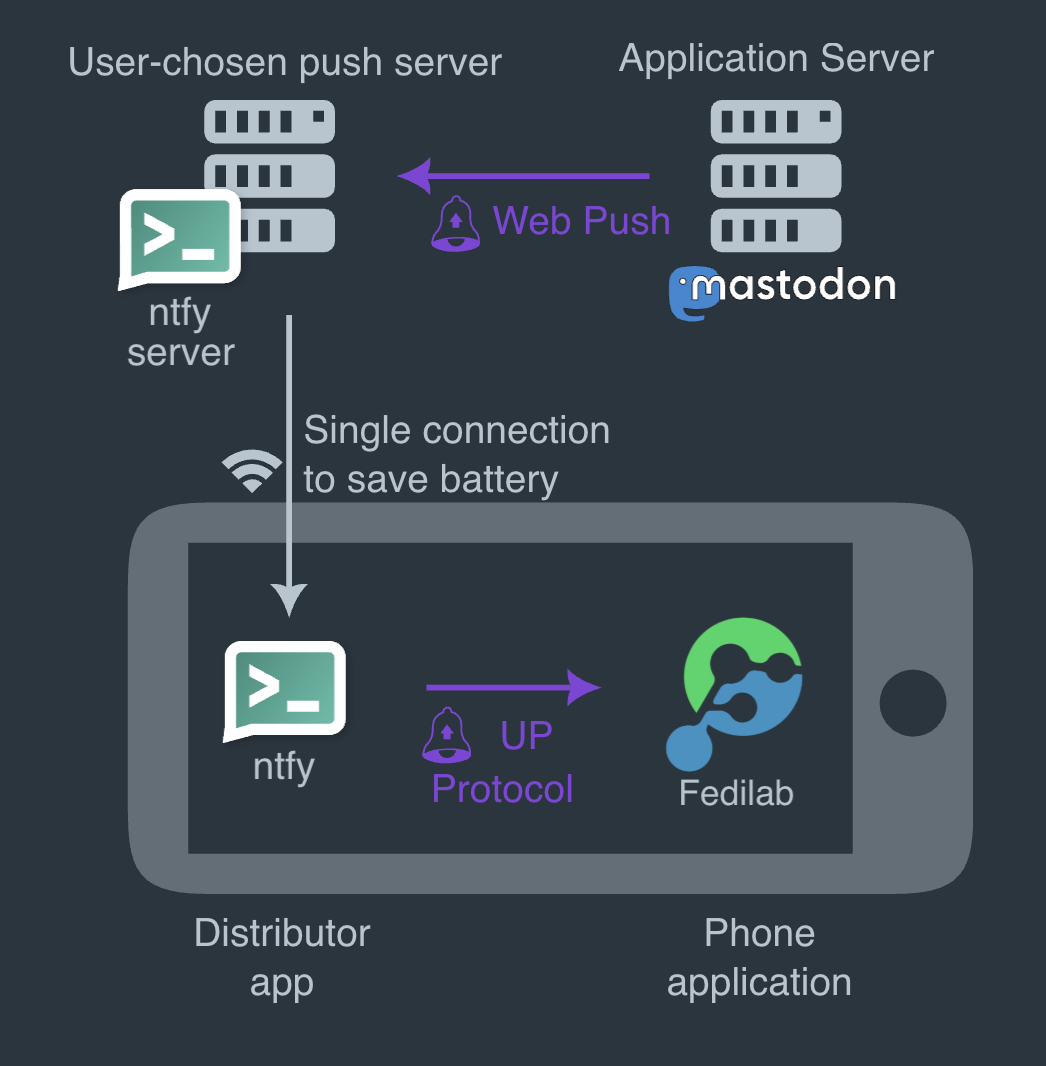
So, together with the application server and the client app, there are totally four components involved:

diagram illustrating UnifiedPush
Diagram of the interactions between components with UnifiedPush.

In this scenario, the client app registers in onto the distributor. The latter contacts the push server to create an endpoint. Once obtained, the endpoint is delivered back to the client app, which transmits it to the application server which stores the endpoint data associated to the user.

When a notification needs to be sent, the application server sends a message to the endpoint it has stored, which points to the push server. The push server processes the message and the distributor, which is subscribed for messages on the push server, proxies the notifications to the client app.

Decoupling the push server and the distributor allows for more flexibility: you are free to use whatever technology best suits you. E.g. on the server side you can choose a self-hosted server like ntfy.sh or NextPush which integrates with NextCloud, SunUp, etc. whereas on the client-side you can use the their counterparts of ntfy and SunUp on Android or dedicated apps (e.g. KUnifiedPush on Linux).

The Breakthrough: Friendica Notifications

Implementing this on Android turned out to be a game-changer. Thanks to the UnifiedPush Android SDK, Raccoon can seamlessly configure distributors, detect when new ones are installed, and let the user choose their preferred routing.

Recommendation

If you are setting this up on Android, I highly recommend using Sunup as your distributor. It is incredibly easy to set up and completely frictionless to use.

The result?

Finally, fully working, privacy-respecting push notifications! With this major milestone ticked off the list, there's officially one excuse less to prefer other Fediverse clients. 😂 🦝

References


  1. If the target platform's server is not directly compatible, Push Gateways are available too. ↩

Dealing with KMP’s Shifting Sands: Another Day, Another Project Structure

Hurray! A few days ago, JetBrains's blog published a new post highlighting the new default structure for KMP projects, which goes hand in hand with the migration to AGP 9.x.

This piece of news hit me last Friday evening. I had just left the office after a long, tiring work week. I got into my car to drive home and opened YouTube, hoping to listen to a relaxing talk during my commutetime… and voilà! There was Márton Braun uttering the frightening words: «We are introducing a new default structure for KMP projects…»

And so there I was — suffering from framework-induced PTSD, nervously blinking and hysterically chuckling alone in my car. I remembered how it took me several days to get my local builds for all platforms, CI workflows, and integrations (Codecov and Weblate, just to mention a couple) up and running correctly.

How on earth is the recommended structure changing again?!

Backstory: breaking changes in AGP 9.0

To fully understand my despair, a little bit of background is needed.

Earlier this year, I migrated from Gradle 8.14.x to Gradle 9.1, and from AGP 8.11 to AGP 9.0.0.

For KMP projects like mine, this meant it was no longer possible to apply the org.jetbrains.kotlin.multiplatform Gradle plugin alongside the com.android.library or com.android.application plugin in the same module.1

Instead, the newcom.android.kotlin.multiplatform.library plugin was introduced. Now, all shared modules must use the new KMP library plugin, while the main Android entry point has to use com.android.application alone.

The previous approach — where all entry points (except iOS which was in a separate folder in order to be opened as an Xcode project) coexisted in a single composeApp module — was no longer viable.

Therefore, I had to create a shared library module, making the Android application a separate module entirely. Ironically enough, this feels a lot like the standard structure we had back in 2023.

I felt relatively lucky because only my Raccoon for Friendica app used the structure they recommended after 2023. My Raccoon for Lemmy app still had a shared module and a separate androidApp module.

But the story doesn't end there.

Ripple effect: broken tests and displaced resources

AGP 9.x also fundamentally changes the source set structure for common unit tests (running on the host system) and instrumented tests (running on a device/simulator).

In my case, I used convention plugins, meaning I apply configurations via the Gradle Kotlin DSL and various plugin DSLs rather than doing it manually.

Trying to figure this out with incredibly scarce and scattered documentation on how to do it properly was a nightmare (and I had to fix it (e.g. here and here).

Not to mention that all Compose resources such as string translations had to be moved from the composeApp mobile module to the shared module, which completely broke my crowdsourced translations on Weblate.

A love-hate relationship

I am truly caught in a love-hate relationship with KMP right now. More than ever, it feels like a brittle foundation to build a long-term project upon.

«Why are you complaining?» you might ask. «After all, early-adoption has always been like this.» And you're right. In the early years, this chaos was expected. Every new technology needs time to settle down until the community reaches a consensus on best practices and shared conventions.

But KMP has been around for quite some time now, and it is supposed to be stable! Yet here we are, and it feels like they introduce breaking changes every six months.

Looking ahead

So here I am once again trying to follow their new standard as closely as possible. I'm doing this in the desperate hope of minimizing the chances of everything melting down with the next release of the Kotlin compiler, KSP, Gradle, AGP, Compose, or whatever else updates next.

At the very least, I’m hoping that by strictly adhering to these recommendations now, the next migration will be less painful. It feels like offering sacrifices to a vengeful deity, praying that my compliance today will earn me a little more mercy when the next storm hits.

As a conclusion, I hope you allow me this little rant. Also, please wish me luck—because as of right now, I have no idea if my iOS build is actually working, and I won't know if any of my release workflows are truly safe until my next beta deployment.


  1. A note on terminology: in the rest of this article, the word "module" is used as a synonym of subproject for brevity, even though in the Gradle lingo the most correct term is "subproject". ↩

Create Adaptive Designs with Window Size Classes

What are Window Size Classes?

Material Design 3 has introduced the concept of Window Size Classes to help developers abstract away the overwhelming variety of device viewports. Instead of designing for multiple specific screen resolutions, we can categorize available space into three opinionated buckets: Compact, Medium, and Expanded.

According to the official documentation, window size classes provide a bridge between designer-friendly breakpoints and developer-centric implementation. They allow us to focus on how the UI should transition between different states rather than worrying about specific pixel counts.

This is especially critical in a project like Raccoon, which targets multiple platforms (Android, iOS, and desktop) where available screen real estate can change in a heartbeat.

Multiplatform Implementation

In a KMP project, querying the current window size class requires platform-specific implementations. We can leverage the expect/actual mechanism to provide a clean, unified API to our common code:

  • Platform-specific query logic: Android requires an Activity context, while iOS and JVM can query window bounds directly.
  • Shared utilities: We keep our business logic DRY by placing the observation and reaction logic in commonMain.

Code Snippets

To obtain the current window size class and react to its changes dynamically:

// in commonMain
@Composable
expect fun getWindowSizeClass(): WindowSizeClass?

// in the androidMain source set
@Composable
actual fun getWindowSizeClass(): WindowSizeClass? {
    val activity = LocalActivity.current
    checkNotNull(activity) { return null }
    return calculateWindowSizeClass(activity)
}

// in iosMain
@Composable
actual fun getWindowSizeClass(): WindowSizeClass? {
    return calculateWindowSizeClass()
}

// in jvmMain
@Composable
actual fun getWindowSizeClass(): WindowSizeClass? {
    return calculateWindowSizeClass()
}

Once we have the size class, we can create shared utilities to make our UI code more readable:

// all in the commonMain source set
@Composable
fun isWidthSizeClassEqualOrAbove(other: WindowWidthSizeClass): Boolean {
    val current = getWindowSizeClass()?.widthSizeClass ?: WindowWidthSizeClass.Compact
    return current >= other
}

@Composable
fun isWidthSizeClassBelow(other: WindowWidthSizeClass): Boolean {
    val current = getWindowSizeClass()?.widthSizeClass ?: WindowWidthSizeClass.Compact
    return current < other
}

A Strategy for Adaptive Layouts

Following established best practices, I chose the Expanded width as our primary breakpoint for structural layout changes. Here’s how the experience shifts across devices:

Compact & Medium Screens

On smaller form factors, I prioritize reachability and density:

  • Bottom Navigation: Main sections are nested here for quick thumb access.
  • Modal Navigation Drawer: Reserved for secondary features and settings.
  • Floating Action Buttons: Tucked into the traditional bottom-right corner.

Expanded Screens

When we have the luxury of space on tablets and desktops, we can reduce navigation depth significantly:

  • Permanent Navigation Drawer: Replaces the bottom bar with a collapsible side panel.
  • Top Bar Actions: Common shortcuts migrate to the top bar for better visibility.
  • Multi-Pane Scaffolds: We move beyond single columns to leverage the full width.

Interestingly, since Raccoon features more than seven primary destinations, a standard Navigation Rail (the MD3 go-to for side navigation) wasn't feasible. This pushed us toward a more custom, collapsible drawer approach that maintains usability without clutter.

Leveraging Canonical Layouts

A cornerstone of Material Design 3 is the use of Canonical Layouts. These are battle-tested patterns—like List-Detail, Supporting Pane, and Feed—that provide a rock-solid foundation for adaptive applications.

In practice, this means reaching for specialized components like ListDetailPaneScaffold or SupportingPaneScaffold. When paired with sub-navigators like ThreePaneScaffoldNavigator, they unlock sophisticated navigation flows where "master" and "detail" views can seamlessly coexist or stack depending on available width—complete with beautiful, built-in animated transitions!

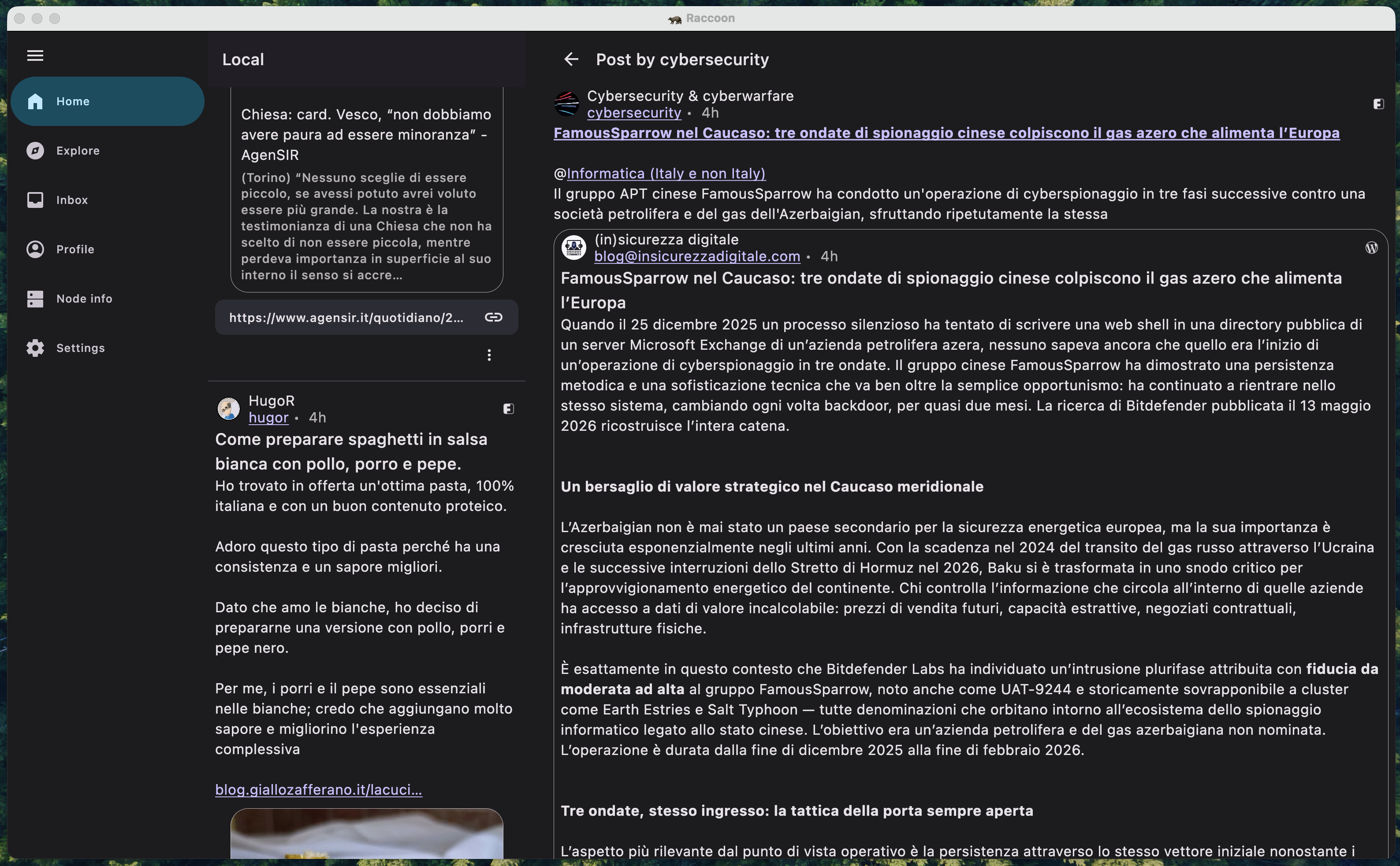
Adopting this approach often implies maintaining two distinct navigation graphs: one optimized for compact/medium screens and another for expanded layouts. A real-world example of this in Raccoon is the TimelineWithEntryDetailScreen, which dynamically reconfigures its internal structure on the fly.

screenshot of list-detail pane scaffold
A screenshot of timeline / detail two-pane scaffold.

Multiplatform and Beyond

This effort went hand-in-hand with adding support for the JVM target for the desktop app. By adopting window size classes, adding a completely new platform was remarkably smooth. The UI simply "snapped" into place once the desktop window bounds were mapped to the correct size classes.

Looking Ahead: Navigation 3

While the current approach of maintaining separate navigation graphs works well, the future of adaptive navigation in Compose looks even more promising. The upcoming Navigation 3 library introduces the concept of Scenes and Scene Strategies.

These allow developers to define how a destination should be displayed (e.g., as a full-screen pane, a detail pane, or even a bottom sheet) based on the current window size class, all without having to duplicate destination logic. It effectively abstracts the "where" and "how" of navigation away from the "what".

As of now, Navigation 3 is still in its early stages and might not be mature enough for production-heavy apps like ours. So I've decided to wait until the library stabilizes further, but the migration path is definitely on my radar.

Question

Who knows? Maybe future update could see Raccoon powered by these new scene-based strategies!

Better documentation with Zensical

If you have visited Raccoon's user manual recently, you might have noticed a major shift. The layout is cleaner, navigation is intuitive, there's a native search box, and you can finally toggle between light and dark themes.

But why the sudden change?

Beyond GitHub Pages

It all started when I began exploring hosting alternatives like Codeberg. As more open-source projects move toward independent platforms, I wanted to see how Raccoon's documentation would fare outside the GitHub ecosystem.

While GitHub Pages is highly integrated, Codeberg favors a "DIY approach." This forced me to re-evaluate my site generator. Jekyll served us well, but it felt aged. I needed something modern, fast, and specifically built for software documentation.

Search for the right tool

I briefly considered Hugo, Jekyll's successor: it's incredibly powerful, but it felt like overkill for just documentation. Then I found out about Material for MkDocs. It was an "ah-ha" moment: beautiful defaults, easy configuration, and a professional look right out of the box.

However, a warning in the build logs gave me a pause:

Warning from the Material for MkDocs team

MkDocs 2.0, the underlying framework of Material for MkDocs, will introduce backward-incompatible changes, including:

  • All plugins will stop working – the plugin system has been removed
  • All theme overrides will break – the theming system has been rewritten

Following the link in the error message I found this article, explaining that MkDocs 1.x is essentially unmaintained and 2.x is heading in a direction incompatible with the philosophy of Material for MkDocs.

Enter Zensical

That's when I discovered Zensical.

Zensical isn't just another theme; it's the successor to Material for MkDocs, built to solve the fragmentation and maintenance issues of the MkDocs ecosystem. It takes everything I loved about Material — the aesthetics, the ease of use, the rich feature set — and builds it on a more stable, forward-looking foundation.

The migration was fairly easy, thanks to sane defaults and exhaustive documentation. Some of the standout features include:

  • Custom palettes & Dark Mode: effortless switching between light and dark themes;
  • Native search: fast, client-side search that just works;
  • Organization: powerful categorization with tags and multi-language support.

But what truly shines are the Markdown extensions. They allow for a rich documentation experience with features like admonitions, collapsible details, syntax highlighting, code tabs, MathJax formulas, and even emojis.

If you are managing a software project and want documentation that looks as good as your code, Zensical is the way to go.

Question

What about you? Have you found a documentation tool that changed the way you share your work?