User manual
Welcome to the User Manual of Raccoon for Friendica! This guide contains an explanation of the most important features of the app and intends to be an near-exhaustive guide to all what you can (and can’t) do from the app.
Table of contents
- Introduction
- General UI structure
- Timeline
- Post detail
- Image detail
- User profile
- Thread detail
- Hashtag feed
- Favorites & Bookmarks
- Followed hashtags
- Explore
- Search
- Inbox
- Profile
- User list
- Follow requests
- Node info
- App information
- Profile settings
- Application settings
- Filter management
- Post composer
- Create report
- Circles
- Direct messages
- Gallery
- Unpublished items
- Calendar
- Announcements
- Shortcuts
Introduction
Friendica is social platform and it has all the features you would expect from a piece of software of this category, you can:
- see the timeline of posts created by other users;
- follow an hashtag and see all the posts containing it;
- create new top-level posts or replies to other’s posts or schedule them for later (and edit or delete your ones);
- like or dislike posts;
- save posts to bookmarks;
- re-share posts;
- follow or unfollow other users, see their profile and subscribe for notifications about their activity;
- edit your own profile and accept/reject your follow requests;
- create your customized feeds;
- see trending hashtags, posts or links (and follow suggestions);
- globally search for hashtags, posts or users;
- mute or block users to filter out contents you don’t like (and undo these actions);
- report posts and users to administrators, etc.
On top of that, Friendica has a series of interesting features which make it stand out among other similar federated platforms:
- you can publish long and formatted posts (with a BBCode-based syntax) and add a title for each post besides the spoiler;
- it supports ActivityPub’s “group” entities, i.e. special kind of accounts which automatically re-distribute all contents mentioning them to subscribers and work like forums;
- it has the concept of user-defined lists or Circles, which can also be used as a target for publication (outbound) and not only as customized feeds (inbound);
- direct messages: you can directly send a message to one of your followed users and have a private conversation;
- image gallery: you can upload photos and organize them into albums, moreover you can easily insert them into your posts taking them from the catalog;
- event calendar: you can create events and make them visible to your followers or see the events that have been shared with you;
- it supports quoting posts inside other posts (AKA cross-posting);
- you can import RSS feeds so that you can follow them as regular accounts and re-share their posts;
- you can delegate the management of an account to one or more other accounts and easily create independent accounts;
- and, of course, much more.
All these features can be accessed using the official web application, but a lot of them are also open to third-party apps using their public APIs.
Raccoon intends to do just that: use the APIs to create a client specifically designed for mobile devices. Since it uses (mostly) the Mastodon-like APIs exposed by the backend, the app is also compatible with Mastodon instances (Friendica-specific features like the calendar or direct messages will not be displayed).
Disclaimer: unimplemented features
The following features are either not implemented or partially implemented due to some lack of support for third-party clients:
- creating events in the calendar;
- voting in polls;
- create an account / delete your account;
- delegating users or access a delegated account;
- re-share posts from imported RSS feeds;
- automatically re-share posts from followed users;
- admin moderation tools (access incoming reports, purge contents, ban users, etc.).
If you want to access those features you will have to use the web interface, except for polls which are not yet supported (it is a well known issue).
This disclaimer does not mean at all these features will never be supported. For example, in the beginning the app could not support embedded images withing post bodies, but the backend devs made a great job and changed the API response in order to make it possible to any app (not just Raccoon!) to display them properly.
Application UI general structure
The application UI is divided into three parts:
- the navigation drawer (accessible from the hamburger menu in the top-start corner or with a swipe gesture from the start direction), containing your user and instance name if you’re logged or just the instance name in anonymous mode and a series of shortcuts to different app sections (e.g. settings or node info pages);
- the bottom navigation bar, containing shortcuts for the most important app sections (Timeline, Explore, Inbox and Profile) which is visible only in top-level screens;
- the main content which usually is structured in the following way:
- a top bar containing:
- a navigation icon (the hamburger or back button) in the start corner;
- the screen title;
- one or more (optional) actions in the end corner or a drop-down “⋮” menu;
- the screen content;
- an optional bottom bar (e.g. formatting toolbar and/or text field).
- a top bar containing:
The totality of the components used come from the Material 3 design system.
Timeline
The timeline section contains a series of posts that belong to either a default feed or a custom feed.
There are three default feed types:
- Local (i.e. posts that have been created or re-shared on the instance you are connecting to);
- All (i.e. posts coming from your instance plus all the federated instances);
- Subscriptions (only for logged users: posts created or re-shared by accounts you are following or which contain one or more hashtags you are following).
Custom feeds, on the other hand, can be:
- any of your user-defined lists;
- a channel, i.e. predefined aggregations e.g. “For you”, “Discover”, “Followers”, “Images”, etc. (Friendica-specific);
- any of the groups you are following (Friendica-specific);
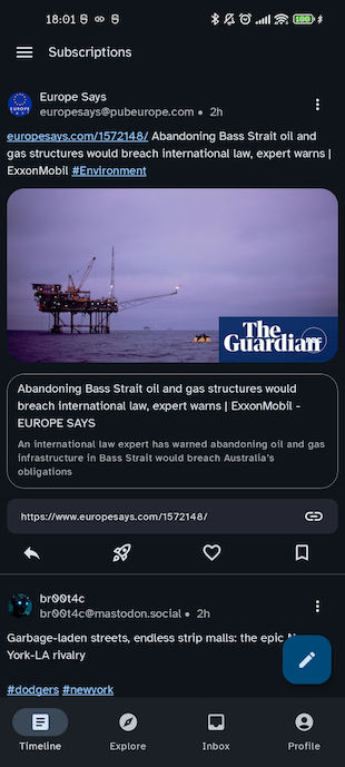
Every item in the timeline has the following structure:
- re-share or reply indication (user who re-shared and original poster);
- author (avatar, display name and username of author);
- creation date;
- title (only from sources which allow it like Friendica or Lemmy);
- spoiler text (optional);
- textual content (visible if no spoiler or spoiler expanded);
- attachments (videos or images);
- preview card (additional preview content or external URL).
If the content of a post contains a hashtag you will be able to open the corresponding screen and if it contains a mention you will be able to open the corresponding profile.
Using the footer buttons, you will be able to perform the following post interactions:
- reply;
- re-share (boost);
- add to favorites;
- dislike (only on Friendica);
- add to bookmarks.
and see the number of replies, re-shares favorites and whether it is in your bookmarks or not.
Moreover, from each single post it is possible to:
- access the profile of all users involved (author, re-sharer or original poster);
- enter the post detail screen;
- open the a drop-down action menu to:
- share it via the system share mechanism;
- copy its URL to the clipboard;
- copy its title and content to clipboard;
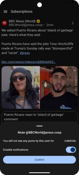
- mute its author indefinitely or for a limited amount of time;
- block its author;
- report it or its author to administrators;
- quote it (i.e. cross-posting it, Friendica-only);
- open a “Details” screen with the raw source and additional information;
- edit or delete it (only if you are the author);
- translate the post content if its language is different from the current one (experimental);
- add a shortcut to the instance where the posts belongs (if it is different from the current one).
Post detail
In this screen you will be able to see it in its context (with ancestors until the root post and all descendants).
Moreover you can the list of users who re-shared it or added it to their favorites.
Apart from that, this screen is very similar to a regular timeline, and allows to perform the same actions and open user profiles or other post details.
If you open a post detail from a timeline-like screen (Home, Explore, Search, Favorites, Bookmarks, list content, hashtag timeline, user detail) you will be able to navigate to the previous or next post in the sequence with horizontal swipe gestures.
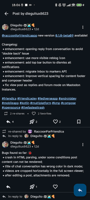
Image detail
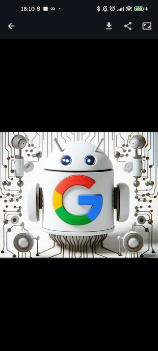
From a video or image attachment, you can open the full-screen image viewer. For images, use double tap to enter the pinch-to-zoom mode.
From the top bar action menu, you can download the attachment to your device, share it as a file or as a URL and, for images, adjust the aspect ratio in case if were not displaying correctly.
User profile
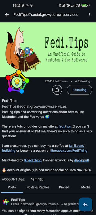
The purpose of the user profile is to display information about a specific user and access the set of contents they have created. There are two flavours of this screen: classic mode (for regular users) and forum mode (for group accounts).
Classic mode
The screen is made up by two parts:
- a header containing display name, username, banner and avatar, number of following/followers (from which you can open the user list), bio and custom fields;
- the list of posts created by the user, which has the following sections:
- Posts list of top-level posts by the user;
- Posts & replies all posts including replies by the user;
- Media posts containing media attachments;
- Pinned posts pinned by the user to their profile;
Each item of these lists allows you to access its post detail.
If you are logged, the headers shows the relationship your user has with this user:
- Mutual (if you follow each other);
- Following (if you follow them);
- Follows you (if they follow you);
- Request sent (if you sent a follow request which is pending);
- Request pending (if you received a follow request from them which is pending);
- no relationship.
If you follow the user, you will also see the notification status (enabled or disabled).
From the top app bar action menu, you can also:
- block/unblock the user;
- mute/unmute the user (and specify for how much time);
- report the user;
- add a personal note on the user;
- switch to forum mode (if it is a group).
Forum mode
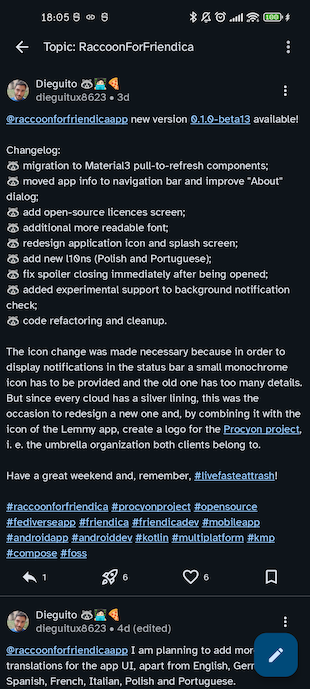
In forum mode, you will be presented with all the top-level posts that have been re-shared by the group, i.e. the list of topics of this forum. This is a special kind of timeline, by tapping on each item you will enter the thread detail.
From the top app bar action menu, you can also switch to classic mode.
Thread detail
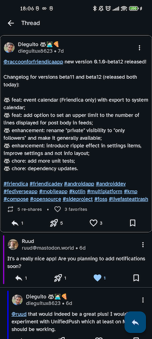
This screen is similar to a post detail but comments are displayed in a Lemmy-like layout, i.e. indented according to their nesting level and with a coloured bar which makes it easier to distinguish parent-child relationship between replies.
Hashtag feed
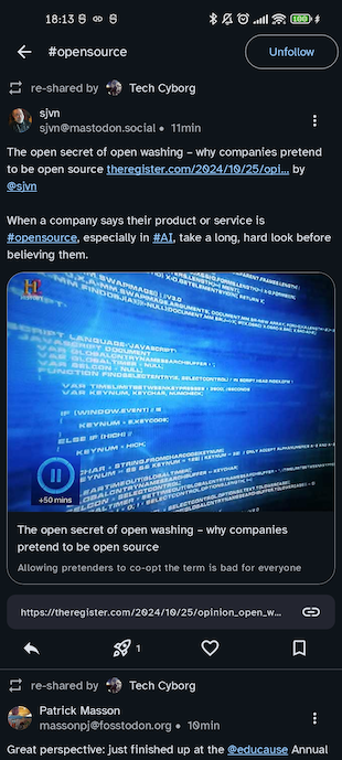
The hashtag feed is a special kind of timeline featuring all the posts containing a given hashtag and it follows the same structure.
From the top app bar, you will be able to follow or unfollow the hashtag.
Favorites & bookmarks
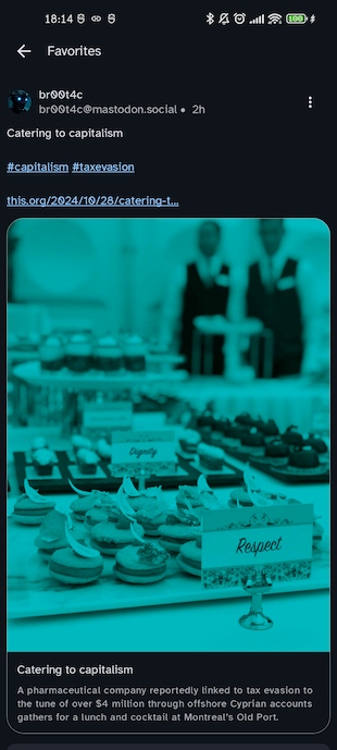
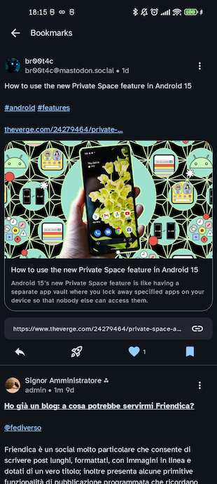
Favorites and bookmarks are special kinds of timelines and they follow the same structure.
The only difference is that if you un-favorite or un-bookmark a post it will immediately disappear from the feed.
Followed hashtags
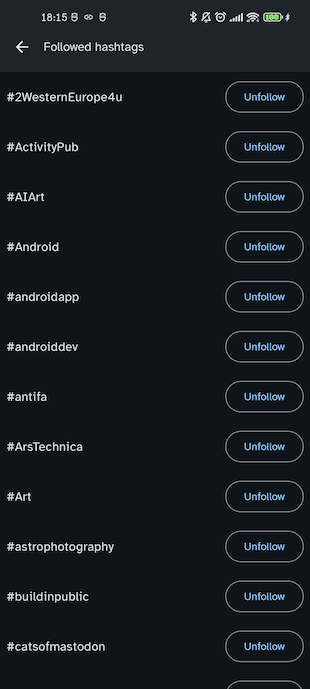
This screen contains the list of all hashtags you are following in alphabetical order, and you can unfollow each one of them.
Each item of this list allows to open the corresponding feed.
Explore
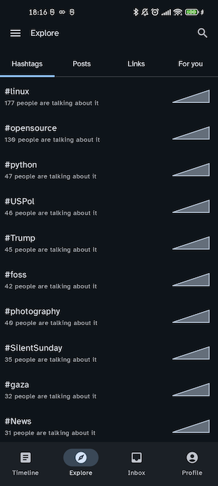
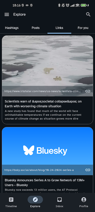
This section allows you to see the most trending content in the instance you are connected to. The screen is divided into the following sections:
- Hashtags contains the list of trending hashtags, with the number of people talking about it and a chart about its usage in the last week;*
- Posts list of treding posts
- Links aggregated view of the URLS used most frequently in posts;
- (only for logged users) For you contains the list of follow suggestions for your user.
Opening a hashtag will lead you to the dedicated feed, opening a post to its detail and opening a user to the corresponding profile. Opening a link will either open the external browser or custom tabs depending on the “URL opening mode” option selected in the app settings.
* note that on different backends the number or days may vary from 1 to 7 days depending on the server
Search
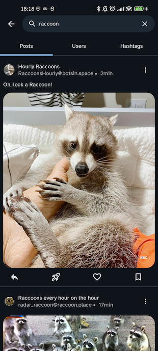
This screen makes it possible to search in the Fediverse: it contains a search field to enter the query string and a tab selector to choose the desired result type (either Posts, Users or Hashtags).
Be careful: it is not possible to search unless a non-empty query has been inserted.
Opening a hashtag will lead you to the dedicated feed, opening a post to its detail and opening a user to the corresponding profile.
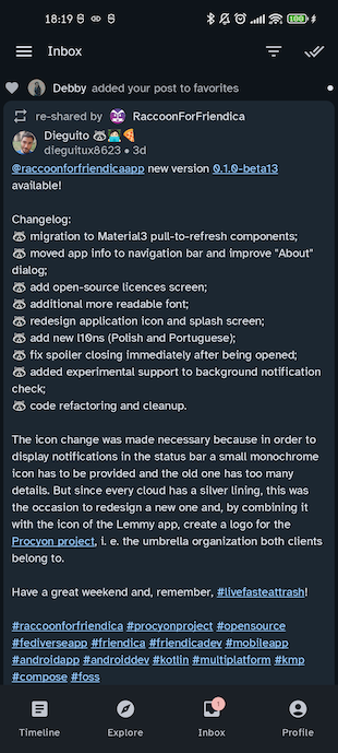
Inbox
This screen contains the list of notifications for the events you have subscribed to, so it is only available for logged users.
The main content presents the list of notifications, which can be of the following types:
- Post a user you enabled notifications for has published a new post;
- Edit a post you have re-shared has been modified by its author;
- Mention you have been mentioned in a post;
- Re-share one of your posts has been re-shared;
- Favorite one of your posts has been added to favorites;
- Follow someone has started following you;
- Follow request someone has sent you a follow request;
- Poll a poll you have participated in has expired.
From the top bar menu it is possible to select/unselect specific categories of notifications to filter the results displayed in the list.
Moreover, it is possible to:
- mark all notifications as read, by simply refresh the page (which will reset the unread counter);
- dismiss all notifications by using the “Done all” button in the top bar.
Be careful: after being dismissed notifications are cleared from the server and you will not be able to browse the list any more!
Tapping on each item of the list, it is possible to open the user profile or post detail.
Profile
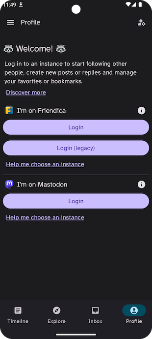
If you are running the app in anonymous mode, the Profile screen contains the Login button to start the authentication flow. If, on the other hand, you are already logged in, it looks similar to a regular user profile but has some additional actions specific for your user.
If you have multiple accounts, in the top app bar you will find a “Manage account” button to switch between one another with a bottom sheet.
Login
The most common way to log-in to federated platforms like Friendica or Mastodon is OAuth2, i.e. a web-based flow thanks to which the app is granted a token to perform a set of specific operations on behalf of the user (e.g. creating posts, follow a user, get the subscription timeline).
This method is recommended because:
- your username/password never go outside browser and remain unknown to all third-party subjects (including the Raccoon app);
- it has finer-grained access levels, meaning you can control the various scopes each individual token can be used for;
- tokens can be revoked at any time, making it easier to mitigate potentially unwanted accesses.
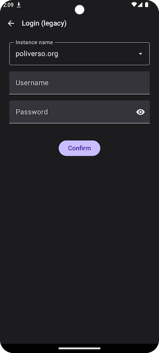
Friendica back-ends, in turn, allow users to authenticate calls using the Basic HTTP standard, which requires users credentials (username and password) to be known to the third-party app using it.
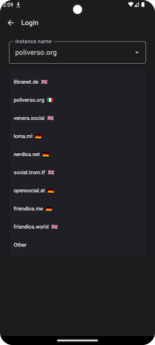
The login flow involves two of these steps:
- an introductory screen where you choose your platform and login mode (the double choice OAuth2/HTTP Basic is only available on Friendica)
- the instance selection (only for OAuth2) where you have to specify the server to connect to; for
Friendica you have the possibility to choose from a drop-down menu or you can manually enter the
domain, for all other platforms you will have to manually enter the server domain (
e.g.
mastodon.social); - the instance and credentials input (only for HTTP Basic) where you have to select your Friendica instance (from a drop-down list or entering it manually) and insert your credentials.
If you do not have an account, you will have to first create one from the instance website, then log in from the mobile app.
One’s own user detail
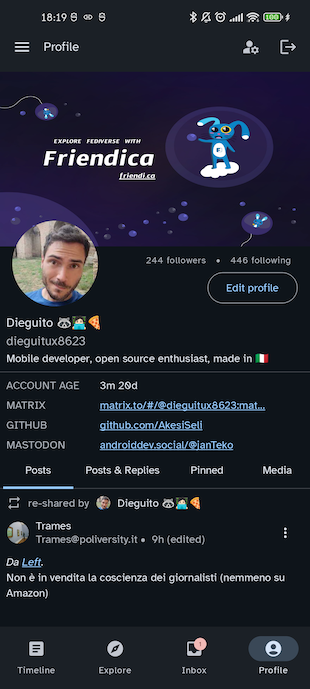
As previously stated, this screen looks very similar to a regular user profile. In the header, instead of the relationship/notification buttons you will find an “Edit profile” button to open your profile preferences.
User list
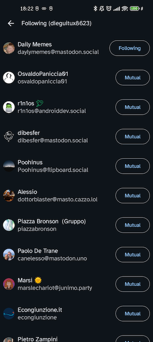
This screen contains a generic list of users; it can be opened either from the post detail (to see who added a post to favorites or re-shared it) or from the user profile (to see who is following or followed by a given user). It displays the avatar, display name and username of users plus the corresponding relationship status.
You can use the follow/send request/mutuals button to modify your relationship with the given account.
Follow requests
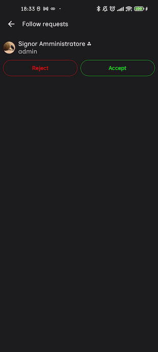
If in your profile settings you have enabled manual approval for follow requests, this screen contains the list of pending follow request you have received.
For each one of the items you can either accept or reject the request, as well as open the corresponding user profile.
Node info
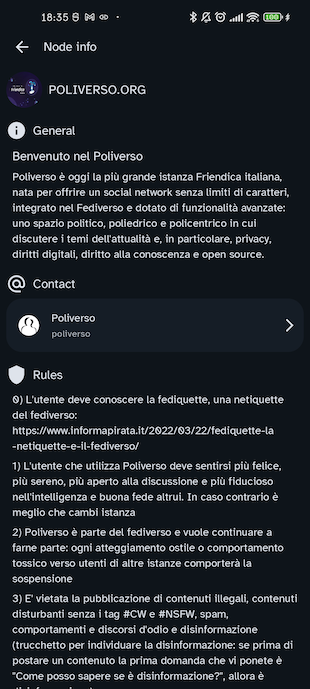
This screen contains some information about the current instance you are connected to:
- banner image;
- domain;
- description;
- contact account;
- list of rules members of this server have to comply with;
- backend type and software version.
App information
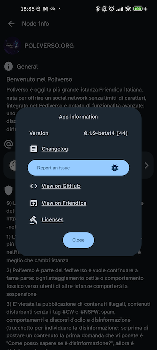
This dialog contains more information about the app:
- version name and code;
- a link to the changelog;
- a button to open a feedback form;
- a link to the GitHub main page of the app;
- a shortcut to the Friendica discussion group for the app;
- a link to the project’s Matrix room.
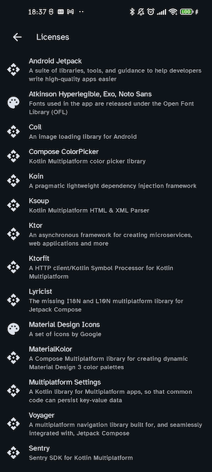
Moreover, this dialog is the entry point for two informative screens:
- the list of licences for the libraries and resources used in the app;
- an acknowledgements page where all app contributors are listed.
Profile settings
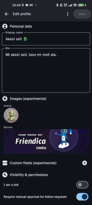
This screen allows you to edit your profile data and configure (to some extent) the discoverability and visibility of your profile.
The profile data which can be edited are:
- display name;
- bio;
- avatar;*
- banner;*
- custom fields;*
- bot (mark account as bot);
- manual approval of follow requests (
locked); - make account visible in searches (
discoverable); - make following and follower lists private (
hide_collections); - include posts by this account in public timeline (
indexable).
* depending on the back-end type these fields may not work, e.g. there are some known compatibility issues on some versions of Friendica
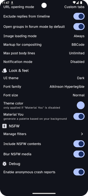
Application settings
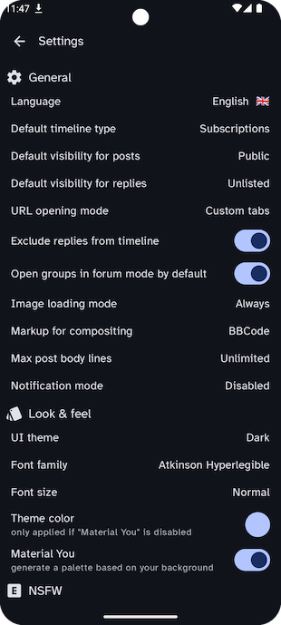
This screen allows to customize the application appearance and behaviour, it has the following sections:
- General
- Language configures the language for the user interface;
- Default timeline type configures the timeline type used by default in the Timeline screen
- Default visibility for posts configures the visibility (
public,unlisted,private- i.e. only followers — ordirect— i.e. ony mentions) used for posts by default; - Default visibility for replies configures the visibility used for replies by default;
- URL opening mode configures how URLs will be opened (external browser or custom tabs);
- Exclude replies from timeline determines whether replies are included by default in the Timeline screen;
- Open groups in forum mode by default determines whether group accounts are going to be opened in forum mode (as opposed to classic mode) by default;
- Image loading mode allows to configure the image loading policy, choosing from the
following values:
- Always images are loaded automatically no matter the type of network connection;
- On demand images are never loaded unless you manually use the “Load” button;
- In WiFi images are loaded automatically on WiFi networks and on demand on metered networks (data saving mode);
- Markup for compositing determines the type of markup syntax used in new posts (plain text — i.e. no markup — BBCode — Friendica-specific — HTML or Markdown — Mastodon specific);*
- Max post body lines configures the maximum number of lines for posts which will be shown in feeds;
- Notification mode allows to configure the notification strategy among the following values:
- Push notification state displays the state of the UnifiedPush integration (e.g. “Enabled” or “Initializing…”, if more than a distributor is available on the device the “Select distributor” value will allow to open a bottom sheet to pick one);
- Check for notifications in background (if “Pull” strategy selected) configures the time interval between background checks for incoming notifications;
- Look & Feel
- Post layout choose the layout used for posts in timelines (full, compact, distraction-free, card)
- UI theme configures the color theme (light, dark or dark optimized for AMOLED screens);
- Font family configures the font used in the UI;
- Font size configures the scale factor applied to fonts in the UI
- Theme color allows to choose a color to generate a Material 3 palette from;
- Material You generate a color palette based on the launcher image;
- Hide navigation bar while scrolling determines whether the bottom navigation (and top bar) are going to disappear or not while the inner screen content is scrolled;
- Application icon change the application icon (default or “classic” one);
- Status and navigation bar theme change the theme of the status bar (top) and of the system navigation bar (bottom);
- NSFW
- Manage filters opens the ban and filter management screen;
- Include NSFW contents enables a client-side filter to exclude sensitive posts;
- Blur NSFW media allows, if sensitive contents are included, to blur images and hide videos when they occur in timelines;
- Debug
- Enable anonymous crash reports determines whether anonymous crash reports are enabled for all accounts (changing this option requires the app to be restarted afterwards);
- Other
- Export settings export the current settings to a JSON file (which can be imported if you change account or clear the app data);
- Import settings import application settings from a JSON file;
* please choose wisely: Markdown is supported only by some versions of Mastodon (e.g. glitch-soc), if you do not know what you are doing stick to HTML or plain text, otherwise your posts may not be formatted correctly!
** in order for UnifiedPush to work, a distributor must be installed on your device, e.g. NextPush and configured with the corresponding server-side NextPush app where you have, in turn, registered and paired the remote account you are currently using on your instance
*** in order for this to work, the application must not have any restriction for background activity, so please make sure the battery saving restrictions for Raccoon in your system settigs
Filter management
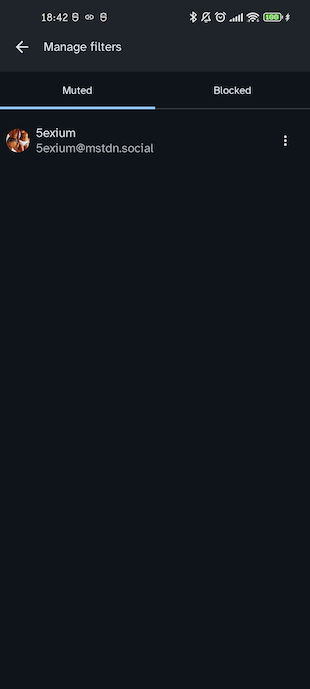
This screen allows to revoke current restrictions on other accounts. It is divided into the following sections:
- Muted for muted accounts;
- Bans for banned ones;
- Limited for user with a rate-limit;
- Words for specific filters based on words you choose to exclude from your timeline.
Post composer
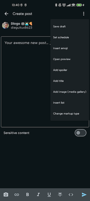
This screen allows to create new posts or replies. The action menu in the top app bar contains the following items:
- Save draft changes the publishing type from regular to draft;
- Set schedule changes the publishing type from regular to scheduled posts;
- Insert emoji allows to insert a custom emoji;
- Open preview opens a preview of the post (only if “Markup for compositing” option in Settings is not plain text);
- Add spoiler/Remove spoiler to add or remove a spoiler for the post;
- Add title/Remove title to add or remove a title for the post (Friendica only);
- Add image (media gallery) adds an image from an album in the media gallery (Friendica only);
- Insert list adds an itemized list;
- Change markup type to change the markup syntax for rich text editing for the current post.
Below the top bar there is a header containing:
- an indication of the current user (who will be the author of the post);
- the visibility (
public,unlisted,private,director a Friendica circle); - the schedule date and time (for scheduled posts);
- the current character count / character limit according to instance configuration.
Below the header you can find the main text field for the post body. In the bottom part of the screen, only if “Markup for compositing” option in Settings is not plain text, you will find a formatting toolbar with the following buttons:
- Add image to add an image from the device gallery as an attachment;
- Embed image add an image from the device gallery in the post body (Friendica only);
- Add link to add a hyperlink;
- Bold to insert some text in bold;
- Italic to insert some text in italic;
- Underline to insert some underlined text;
- Strikethrough to insert some text with a strikethrough effect;
- Code to insert monospaced font;
- Submit the submit button displaying:
- a Send icon for regular publication;
- a Save icon for drafts;
- a Schedule icon for scheduled posts.
Create report
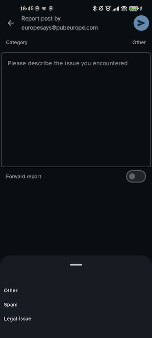
This screen allows to create a report for either a user or a specific post.
It contains a selector to choose the kind of violation among:
- Spam the post is spam or user is spamming;
- Legal issue the post or user infringes some existing legislation;
- Rule (Mastodon-only) the post or user does not follow the instance rules (in this case you will have to select which rule is violated);*
- Other any other kind of issue.
Below you can write the report body in a text field and, finally, the “Forward report” switch allows you to select whether this report should only be delivered to your instance admins or, if you are reporting a content coming from a federated instance, it should be handled by the admins of the source instance too.**
* on Friendica rule violation are not supported yet and if they are submitted they get rejected by the server (with a 422 - Unprocessable entity), so this option has been hidden
** on Friendica this switch is supported (does not cause a 422 error) but it does not seem to have any effect
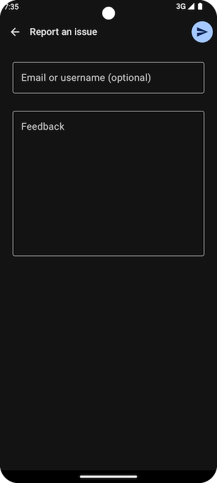
User feedback
This form allows you to submit your feedback to the developers (e.g. to report a bug or suggest some improvements).
Apart from writing your comment, you can optionally specify an email address (e.g. if you wish to be contacted for clarifications).
This is just a utility screen for those who prefer not to use the issue tracker on GitHub (e.g. because they do not have an account).
Warning: this only works if you have activated the “Enable anonymous crash reports” option in the settings screen.
Circles
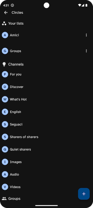
This screens contains all the custom feeds that can be used in the timeline, which comprise:
- user-defined lists (like Mastodon lists or Friendica circles);
- Friendica channels;
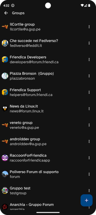
- one item for each group among the accounts you follow.
The reason why all these heterogeneous elements are in the same list is because they are all returned by the same API for compatibility with Mastodon clients.
To make it easier to browse and understand this list, Raccoon divides the list in sections, each with its header specifying the type of the following items.
Among these three categories, the only one which allow to be modified is the first one, for which you can use the “⋮” button to:
- edit the circle name;
- delete the circle;
- see the circle members and add new ones (with the “+” button) or remove existing ones.
Please remember that in Friendica by default all non-group contacts are added to the “Friends” circle and all group contacts are added to “Group”. Albeit being created by the system, “Friends” and “Groups” are regulars circles that can be changed or deleted.
By tapping on each item in the circle list, you will open the corresponding post list, i.e.:
- the forum mode for groups;
- a dedicated timeline, for all other circles.
Direct messages (Friendica-only)
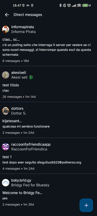
This section contains the list of private conversations with your contacts. For each item in the list, you can see:
- the contact avatar, username and display name;
- the title of the conversation (defaulting to the first message);
- some lines of the last message;
- the total number of messages;
- the time elapsed since the last message was received.
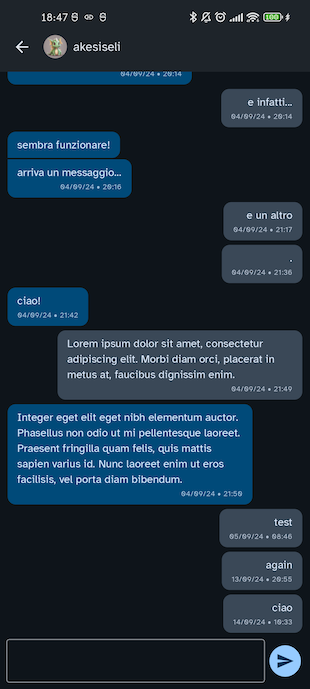
Tapping on each item you can open the conversation detail, in the form of a traditional chat with message bubbles and a text field in the bottom part of the screen to send new ones.
Messages are being downloaded as long as they arrive while you are in this screen, otherwise you have to manually refresh the conversation list.
Gallery (Friendica-only)
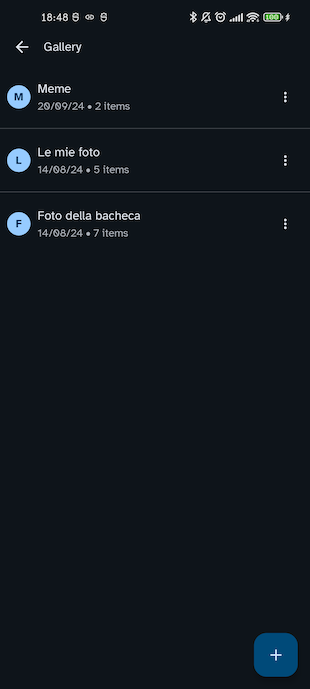
This screen contains the list of albums in your multimedia gallery. For each album you can either edit its name, delete it or, tapping on the list item, access the pictures contained in it.
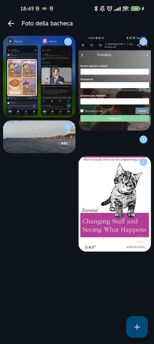
For each picture in an album, you will have the possibility to:
- edit its description;
- delete it from the Gallery;
- move it to another album.
Unpublished items
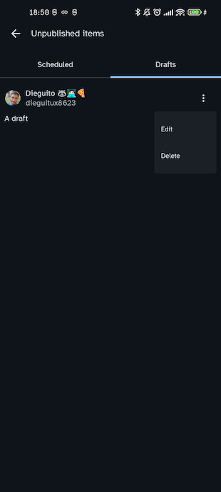
This screen contains all the items awaiting publication and it is divided into two sections:
- Scheduled i.e. the list scheduled posts;
- Drafts i.e. the list of drafts you created;
each item can be deleted or, by tapping on it, opened in edit mode.
Beware that on most instances scheduled posts can not be modified except for their schedule date, so the preferred way to save a post and edit for later is:
- create a post with the “Only mentions” (
direct) visibility without mentioning any user so that it is only visible to you; - create a draft, keeping in mind that draft are just local records saved in the application database and are not stored anywhere remotely, so will lose them if you change device or clear the application storage of Raccoon.
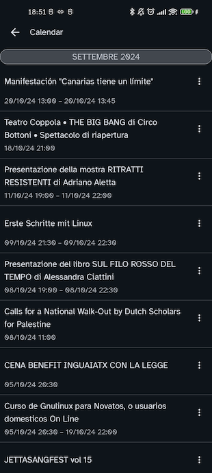
Calendar (Friendica-only)
This screen shows the event calendar, i.e. the list of events shared with you divided by month with, for each item:
- event title;
- start date;
- (optional) end date;
- (optional) location.
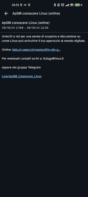
For each event, you can export it to your device calendar and, by tapping on each list item, access a detail screen where more details (like a more extended description) are displayed.
Announcements (Mastodon-only)
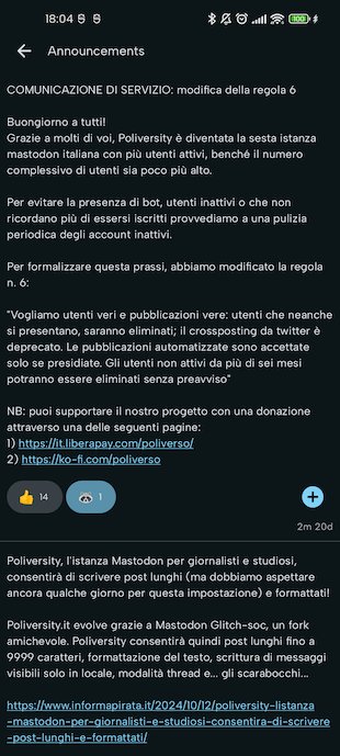
This screen contains the list of announcements published by instance admins.
For each item in the list you can see:
- an unread indicator (if the message is new);
- the announcement textual content;
- the list of user reactions;
- the publication date.
Every time you refresh this list, all unread items are marked as read.
You can tap on an existing reaction to increment the counter by 1 or you can use the “+” button to insert a new reaction. If you tap again on your reaction, you are going to removed it and the counter will therefore be decremented by 1.
Shortcuts
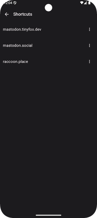
This screen contains a list of the shortcuts to foreign instance you added from the post drop-down menu. By using the “⋮” button, each item can be removed from the list.
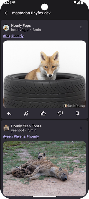
If you tap on an item, the corresponding local timeline will be displayed. This screen looks very similar to a regular timeline but, whenever you perform an interaction (e.g. like or add to bookmarks) the post is “translated” to a reference on your current instance and the action takes effect on that (this is why operations may take longer).
